Los Angeles County Museum of Art, 1965
Today's post will probably only be of interest to people who are fans of vintage Los Angeles.... but maybe a few others out there will find it interesting too!
The Los Angeles County Museum of Art (or "LACMA") is a place that I have visited many times over the years; you can easily spend three or four hours looking at great works of art, and still not see it all. It just depends on your tolerance for "museum feet"! It has recently been announced that there are plans from the museum's directors to raze the remaining original 1965 buildings, which were designed by William Pereira. He designed many buildings of note, including San Francisco's Transamerica Pyramid, the original Disneyland Hotel, and the futuristic "Theme Building" at the Los Angeles International Airport (with Charles Luckman).
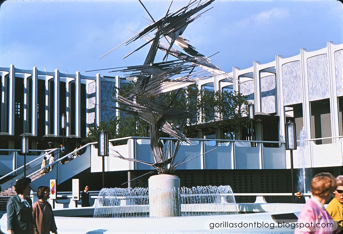
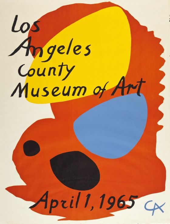
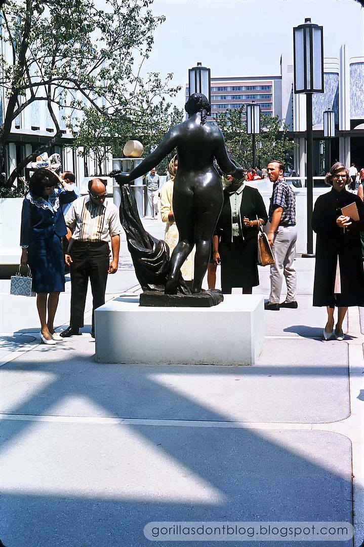
I thought I would share some images from when LACMA was brand-new, sparkling and clean, and the pride of the city. I wish I could find some info about the jagged sculpture, but I Googled and Googled, with no results. If you look closely, you can see a yellow and red poster in the lower left corner.
Hey, there it is! It was created for the museum's opening by Alexander Calder (an artist I especially admire). Those colorful shapes remind me of his playful, kinetic mobiles.
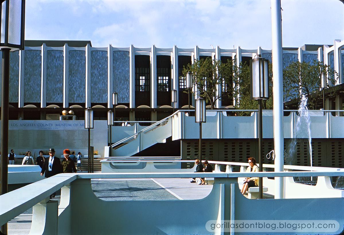
As you can see, the buildings are very much a product of their time; one writer said that they ...convincingly capture the cultural optimism of the 1960's. I completely agree! Over the years, other structures have been added, in varying styles; they've increased the amount of exhibition space, but they have also turned the place into an odd jumble of contrasting aesthetics.
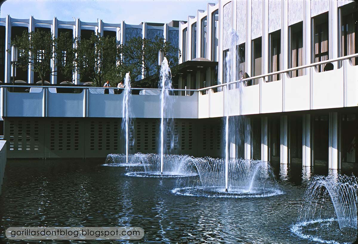
The pond and fountains are long-gone... until I saw these pictures, I had forgotten that they were ever there! The proposed new building (designed by Swiss architect Peter Zumthor) is a huge amorphous shape that has already been nicknamed "The Black Flower". You know what? I don't hate it! In fact I think it's kind of neat.
So much of "vintage L.A." has been destroyed, I don't like the thought of losing the original 1960's Pereira LACMA buildings. But I am also intrigued by what may replace it (you can read about it here and here). Many Parisians hated the Eiffel Tower when it first went up! I have no idea how well the Black Flower will function as museum space, but it could become a beloved architectural landmark - in time. As you can tell, I am completely wishy-washy about the whole subject.

10 comments:
Space Sculpture (1965) by Norbert Kricke (1922-1984). A gift of Mr and Mrs David Bright.
THANK you, D-ticket!
Ahhhh - LACMA. The stories I could tell. I worked there from about 1972-1980. I lost all respect for Mr. Pereira after spending time there. This was not one of his better efforts - to put it politely; and I will not mourn its passing. "All the tackiness of the 1960's without any of the 'flair' - as can be evidenced in the Dorothy Chandler Pavilion". Besides being built bass-ackwards (both the theater and restaurant were at the opposite end of the layout from the loading dock). Go figure. And that's just the beginning of his many stupid ideas executed there.
And on the construction side: both the plaza and fountains leaked into the building. The leaking fountains were solved by replacing them with a "sculpture garden" of dubious distinction; the leaks through the plaza pavers, by installing troughs beneath the overhead "ceiling" in the basement offices to catch the leaking water. I could go on, but that would take away from these marvelous images and the memories they evoke.
Can't let the moment go by without noting the fabulous hairdo and glasses being featured by the lady in the 3rd image, and her "escort", sporting a fine example of haberdashery.
Thank you, Major for bringing back memories - both good and not so much.
I like the "feel" of the architecture, even if the actual layout and construction left a lot to be desired. Reminds me a lot of several of the buildings at my alma mater, built during a 1960s expansion.
Somehow, the people in the photos don't look quite right. There isn't a single Starfleet uniform in sight.
Nanook, what are the odds that one of GDB's commenters had actually worked at LACMA? I am not surprised about the fountains and ponds caused problems…. water and buildings just don't seem to want to mix. In spite of all the issues that you mention - all valid - I can't feel the hate for those buildings! To me, they represent a look that was in vogue during the period of the 1960's, maybe that's partly what I like about it.
Many of Frank Lloyd Wright's buildings had leaky roofs, sagging cantilevers, etc - innovative, amazing, but often not very practical (like the famous Marin County Civic Center, or even Falling Water)… but I still like to look at them.
Chuck, your Starfleet comment made me laugh… when I was watching the most recent Star Trek movie ("Into Darkness"), I recognized the Getty Center museum, used for Star Fleet headquarters (with help from digital elements)!
Major-
Oh, I get how they capture the 'look' of the 1960's. I just feel there are better examples that have stood the test of time better than these. William Pereira also designed the very tall building directly across Wilshire Blvd - sort of a 1970's 'take' of the 1960's 'look'.
@Nanook - Thanks for the insight into working at LACMA. Very interesting take on the place.
Nice update Major! The futuristic space sculpture is cool.
Very cool....mid century mod is groovy!
so sad some feel the need to rip it out and make it something else instead of keeping history alive and just find another spot for whatever else they want to do :-(
Major and all, thank you for these pictures and comments that really bring back happy memories for me of many visits to this place.
In spite of the shortcomings of the design and construction, I feel bad to see the old '60's look get such short shrift in light of what's coming.
It sounds like the LA board is envious of the new San Francisco De Young art museum and are intent on bringing their own version of Swiss-German inarticulate and hermetic design to the patrons of Los Angeles.
These designs are always less about function than formalism (in the sense of serving another purpose than the display or service of Art) and always most about serving the ego's of the board and donors et al.
Having worked on multiple museum design commissions, I can confirm this is most assuredly so.
It's doubly sad just when the mid-century style is coming to be appreciated again, modernized, updated and sometimes re-interpreted by today's designers with our modern materials, we can fix a lot of the issues plaguing buildings that really were "before their time".
Good old architecture is truly lost when it's owners no longer deserve to have it.
JG
Great shots and certainly are helpful to people who have only seen the museum campus in the last 30 years or so since the Hardy Holtzman Pfeiffer carbuncle was shoved down its gullet.
While perhaps not as lyrical as Pereira's LAX Theme Building (now 'Encounters')or as iconic as his Transamerica pyramid in San Francisco (which has also known its share of detractors), the Pereira LACMA campus IS still a serviceable set of buildings (with expansions and updates) AND a touchstone to an important moment in LA's midcentury cultural heritage. We've lost too many of those landmarks to be cavalier about just tossing another one on the junkheap of history for the sake of fashion. Keep in mind, Pereira's work is just beginning to enjoy a re-examination in museum shows (at OTHER museums, of course) and even being landmarked in nearby communities.
Our belief is that the original LACMA buildings can be restored and saved, and a new addition -- even by Peter Zumthor, can be built alongside. His current version is a lose-lose proposition: we lose History and the new design is a shockingly poor solution from such an otherwise able superstarchitect.
For those interested in the battle to keep the Pereira buildings viable, please I hope you'll visit our effort on Facebook: https://www.facebook.com/SaveAndRestoreTheOriginalLacmaBuildings
PS: The Dorothy Chandler Pavilion was by Welton Becket. And it's ALSO handsomer than many people give credit.
Post a Comment