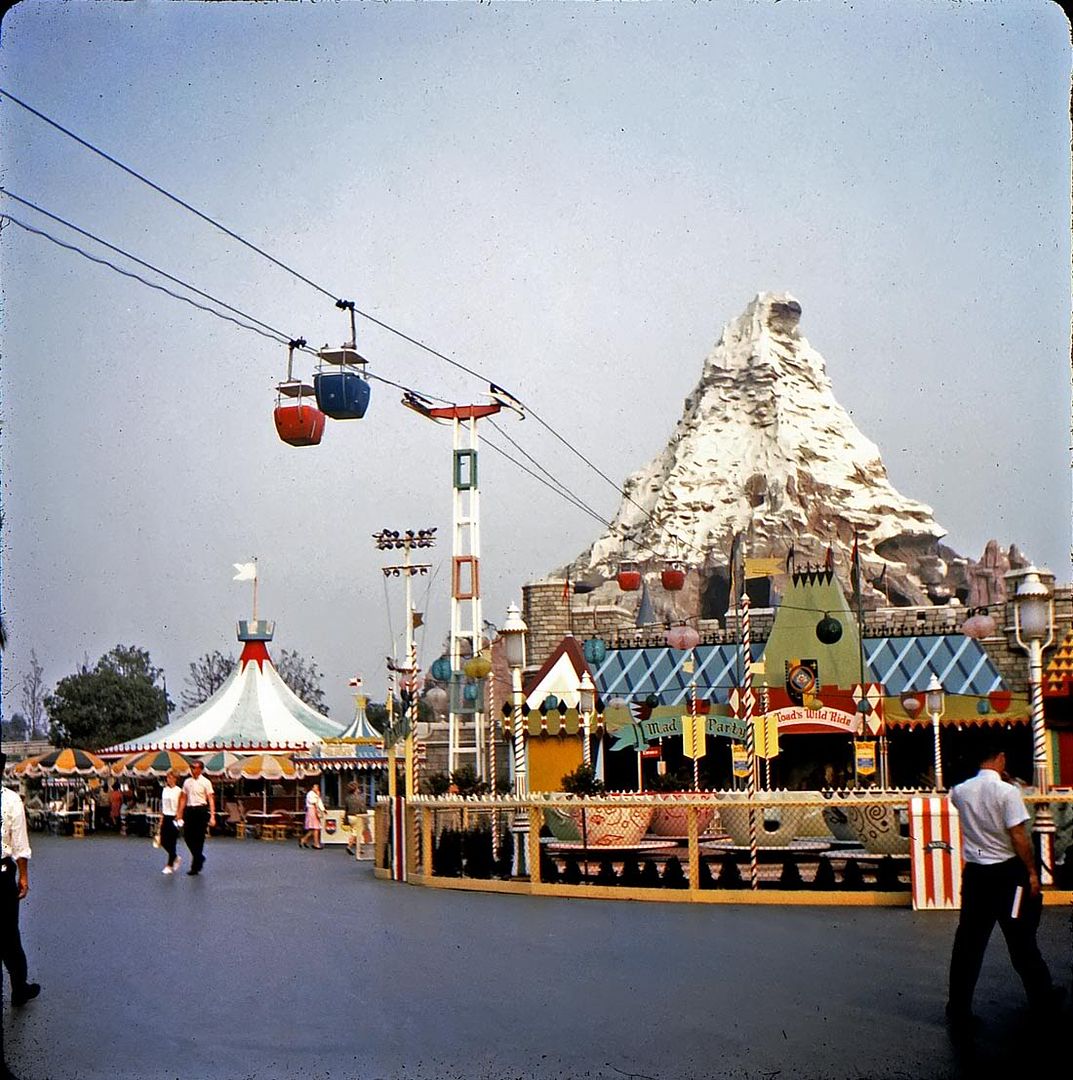
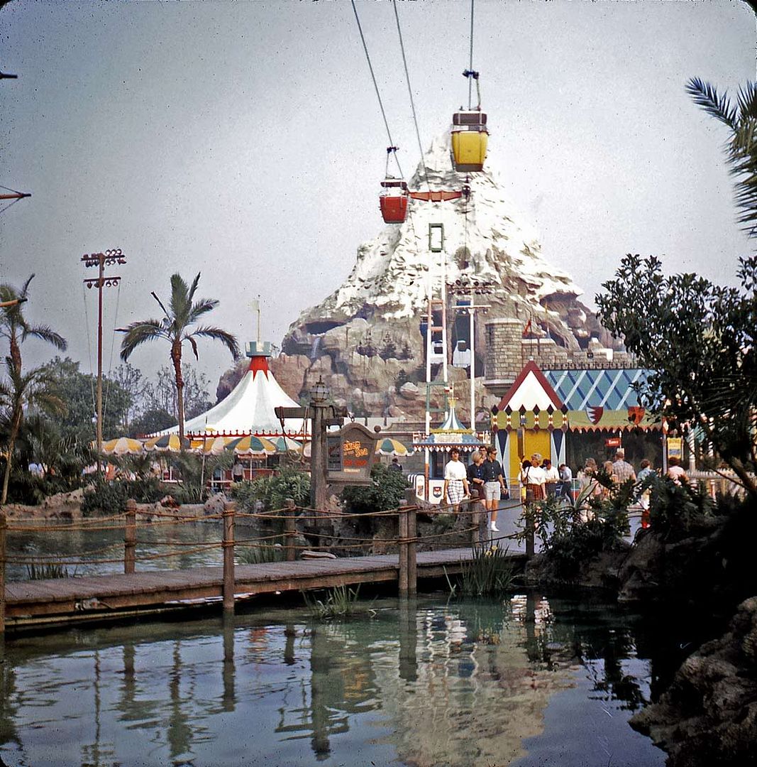
Matterhorn, April 1966
Here are two nice photos of the Matterhorn, presumably taken mere minutes apart. The round Skyway buckets are gone, replaced by roomier rectangular models. Most of Fantasyland looks pretty sleepy - - the Teacups might not even be operational. Even the line for "Mr. Toad" is practically nonexistant!
This one looks hazier, but maybe it's because of the way I scanned it. I'm in a hurry so often these days! Anyway, it's nice because of the Pirate Ship "lagoon" in front of us with its reflections, giving us an unusual view.

6 comments:
Love the Matterhorn. It's The Horn That Matters!
usually... where were we ...yes I like both of these actually, they're neat perspectives.
There may be a lot of blacktop in the top one, but that "medieval fair" look sure stands out in all its ah not-so-grand as the redo glory.
The second is even neater 'cause I like the Skull Rock Cove. Check it out, tropical cove complete with wooden bridge, water and tropic palms, supported by a garish medieval fair zone complete with grand carousel framing the Swiss Matterhorn! That's a lot goin' down in one view.
i really like these images. the Disney "iron" rides of the early days with their cardboard-looking signage always remind me of the carnivals that come to town every summer, and it looks like they could just pack them up and move on at any time.. : (
love the picture of the view from the footbridge, one i dont recall ever seeing before, very pretty with the water reflecting our Majestic Matterhorn
as someone who never got to go there till this century, whats there under the bigtop? its too short to be the carousel; a restaurant, perhaps?
thanks again, Major! all pictures showing the Skyway are good with me. its the FIRST ride i would bring back if i had my druthers!
Except for Capt. Hook's Pirate ship, I can't say I miss much about the old Fantisyland since it was replaced with something so much better. Remember, however, that Walt was on a tight budget to build Disneyland, and there was a lot of economy in building what you see here. The show buildings are all off-the-shelf steel industrial sheds with faux stone veneer. Steel sheet metal made to resemble tents gives the elevations some relief: and the simple geometric shapes means that the pavilions can be made and painted cheaply by non-artist types.
A real redeeming feature are the colors, which were done by Eyvind Earle fresh from "Sleeping Beauty". The interplay between blue ribbons on the "Toad" awning is particularly handsome.
And yes, I'm sure the round tent at right is a hot dog stand, but we never ate there when I was young so my memory about this is a little fuzzy.
Truly some of the best Fantasyland pics I have seen.
The horn that matters... Chiana, I am ashamed that I didn't think of that one myself!
I do miss the old Fantasyland, but agree that the 1983 upgrade was a smashing success. But... we lost the Pirate Ship and Skull Rock.
Thanks for your nice comment, PTA, that's some compliment. I think if you look around Daveland and Stuff From the Park, you'll see some other pretty amazing photos!
Fantastic views this time around. Both of these are not the typical viewpoints and really give you a sense of being there. I find it fascinating thinking about what it was like then versus what I see now.
I have to say I prefer the fairytale village look of now to the medieval carnival look of yesterday--but I understand the reasoning behind it and still admire it for the charm it managed to evoke.
Brer Dan
Post a Comment