Posterama III
Yo yo yo, homies! If you like Disneyland attraction posters, than today's post is for you. If you don't, then a baby angel will die. And none of us wants that, do we?
A few weeks ago somebody (I forget who it was) requested a look at the poster for Tom Sawyer Island. Here it is! This one is somewhat rare. Even with its limited palette of six colors (not counting the white of the paper) manages to capture the feel of a bright sunny day. The first version of this poster mentions that Tom's Treehouse was the highest point in Disneyland, but the Matterhorn eventually trumped the treehouse.
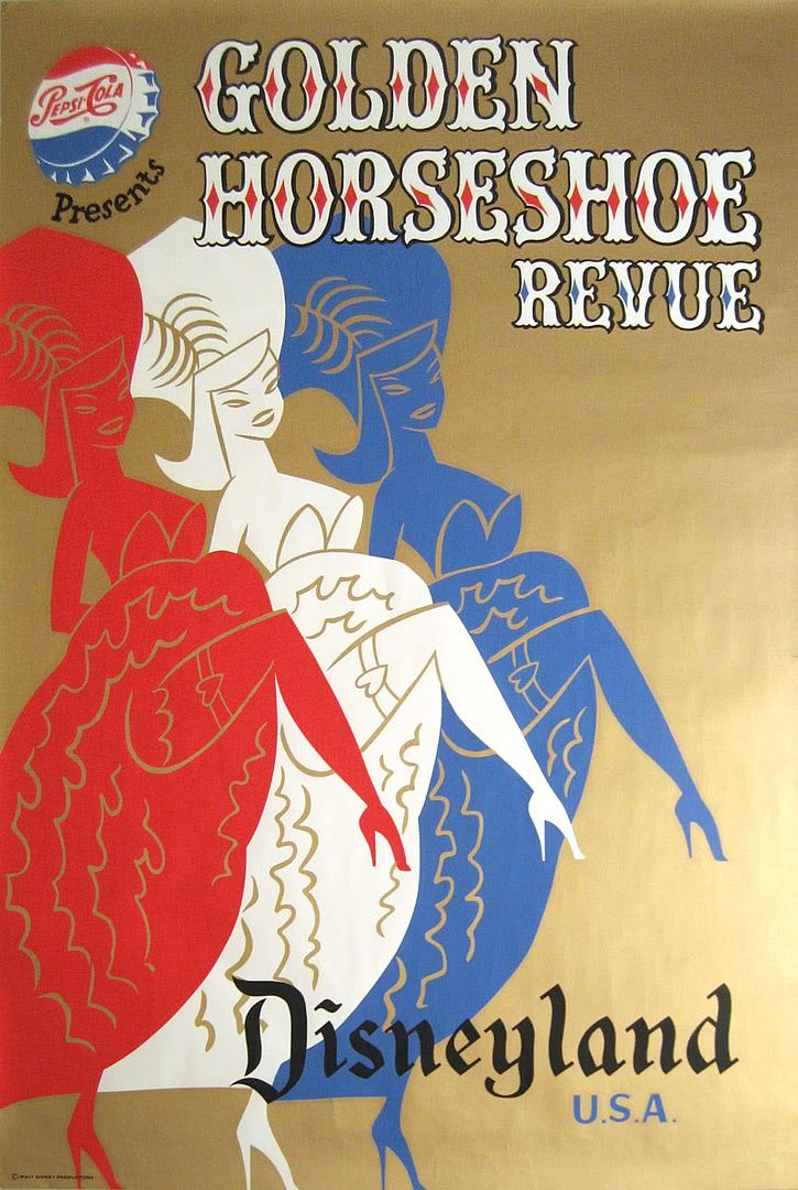
This "Golden Horseshoe Revue" poster is probably familiar to most of you. Pepsi gets a prominent mention as the attraction's sponsor. This is one of two posters that I am aware of that use metallic ink (the silver Monorail being the other), which is why that gold background is so difficult to photograph evenly. I once saw a variant of this poster that said "Frontierland" instead of the more common "Disneyland U.S.A.".
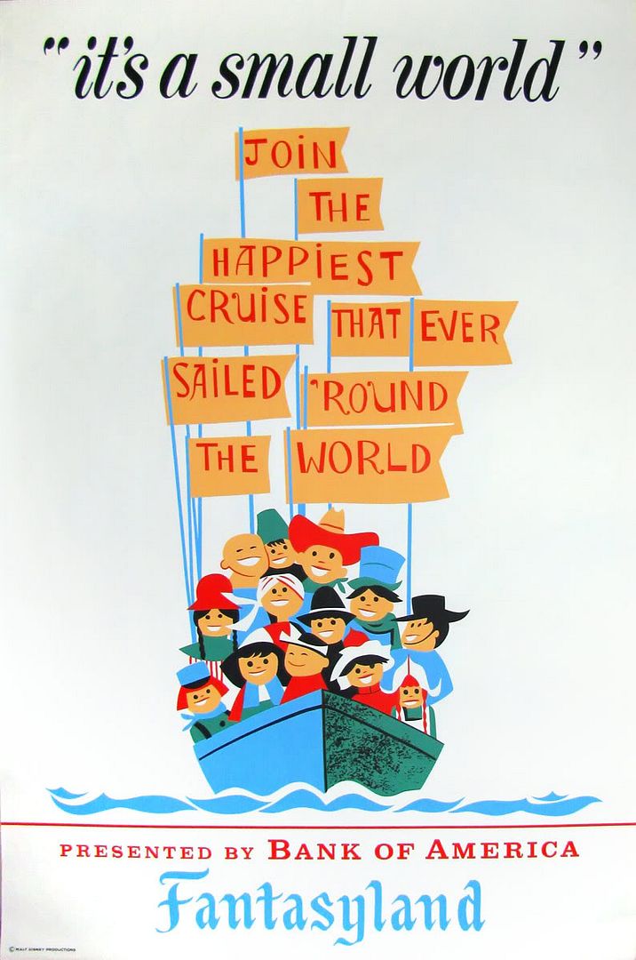
And finally, a relatively common (and inexpensive) poster, for "It's a Small World". The design is a bit lackluster for such a colorful, whimsical attraction. If only they had used some of Mary Blair's wonderful combinations of hues, this one could have been a knockout! Still... I can't help but love the poster anyway. I'm a hopeless case!

3 comments:
"Yo yo yo, homies!" I gotta see you say that in person! A baby angel will die? OK, OK, I love attraction posters :-) That small word poster looks like some of the "simpler" brochures I've seen for the attraction. The Golden Horseshoe poster with its metallic ink is dreamy, Daveland did an amazing painting of this poster, I can't even draw stick figures...
Thanks Major!
These are merely fantastic rather than overwhelming.
homie here....these are beautiful! thanks, Major!! :)
Post a Comment