Posterama 19
Avast, ye swabs!
Today I'm sharing a photo of my Pirates of the Caribbean poster. Arrrrr! If you compare this example to the other original silkscreened posters, you'll see that it is quite different, stylistically. Instead of the bold, simple shapes and colors of the 50's and early 60's, this poster appears to mimic the style of Marc Davis' pen and ink sketches. Perhaps it was supposed to look like an old engraving.
The background has an interesting gradation from dark amber on the edges to a lighter orange in the middle. Not sure how they achieved this effect via silkscreening, since I don't detect any kind of dot pattern; it's as smooth as can be. Some examples of this poster are quite a bit darker on the edges. Notice the subtle gray map in the background as well. The fearsome pirate holds a cutlass and a flintlock pistol - all the better to defend his treasure chest.
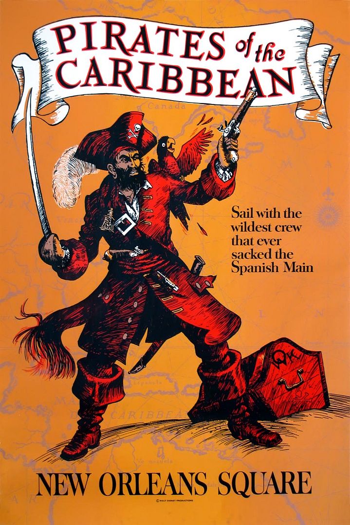
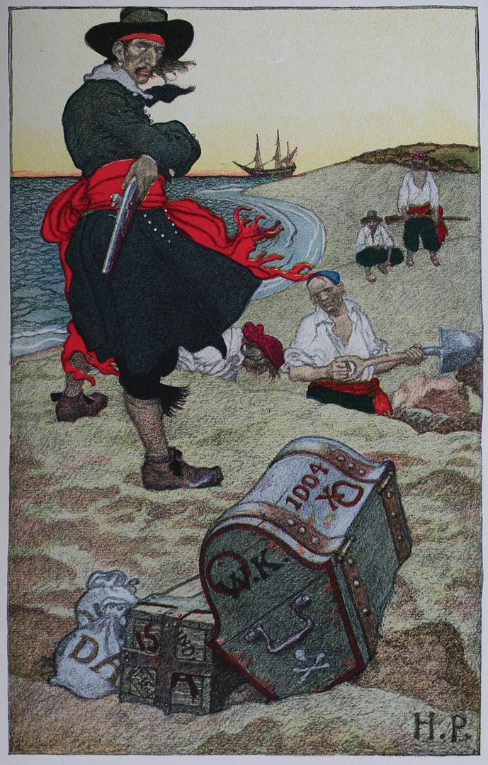
That chest strongly resembles one seen in Howard Pyle's famous "Book of Pirates". The WK stands for William Kidd (aka "Captain Kidd"), one of the most notorious pirates in history (or an unjustly persecuted privateer, depending on who you believe).

8 comments:
Wow, I've been waiting for this post for a long time.
Many Moons, Many Buffalo since you hinted that you had this poster and would share it.
So very very cool, and a Howard Pyle illustration to boot.
Truly a treasure trove today, Major!
Thanks won't do it, but it's all i can write in this little box.
JG
I'm glad you enjoyed this one, JG!
My favorite poster!
ERic
Major - With silk screening/printing, it is possible to do a "blend" background. The rollers would have orange on the outside and the yellow color in the middle. When the poster went through, it would appear as a gradient. Of course, after running a certain amount through, the colors would mix together, get muddy, and then the ink rollers would have to be cleaned and reset again; quite a pain in the arse, but really makes a beautiful and one-of-a-kind art piece.
Dave, your description might explain the variations that I've seen in Pirates posters (some with darker edges, etc). I generally think of silkscreening as producing flat areas of color, but my knowledge is pretty basic admittedly. Thanks for the input!
Eric, I agree that this one is a beauty.
i do have a certain love for Pirates...the baseball kind! that poster is gorgeous, the colors amazing. thanks for sharing!
Beautiful! The detail and colors are amazing.
Deb @ Focused on the Magic
Ah, it takes me back to my youth, a time when I sailed the seven seas with me fellow pirates. (I can dream, can't I?)
Post a Comment