POSTERAMA 13 (more fun with a black light)
Today's "Posterama" is a bit different from past installments; neither of today's two posters is an attraction poster. One of them isn't even a Disneyland poster! But they're still great.
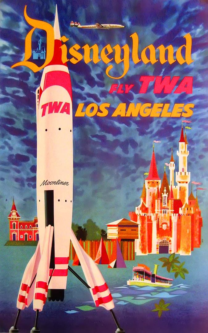
You might remember this fantastic TWA travel poster from a previous post; as I mentioned back then, this poster appears to be part lithograph, part silkscreen, with the lettering being the silkscreened part. The day-glo ink pops even without a black light, but as you can see, it really dazzles when viewed with UV!
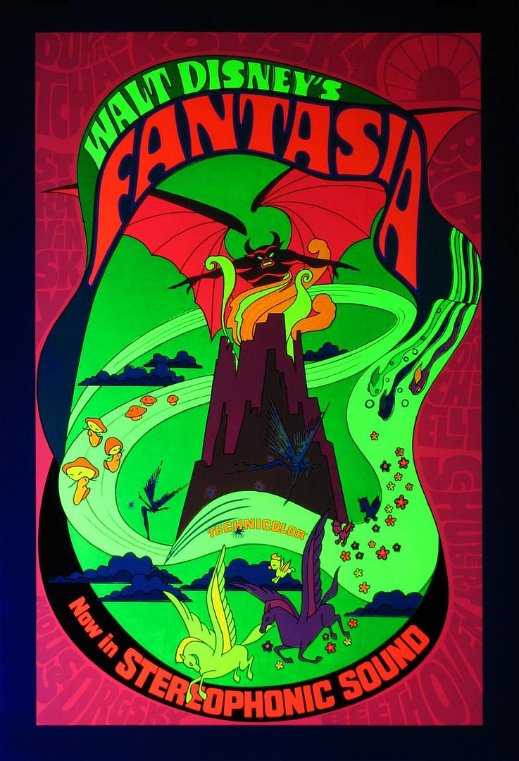
While I was photographing the other glow posters, I noticed that this one glowed brightly as well. It is from the 1971 re-release of Fantasia, and the poster bears some resemblance to the psychedelic rock posters (from the Fillmore and The Avalon Ballroom). Fantasia gained new popularity among hippies, and this design seems to be aimed right at them. It looks pretty cool - does that make ME a hippie???


9 comments:
Pop is right - and now I'm feelin' some hippie-ness urging me to go watch Fantasia.
TWA poster ROCKS! Wow!
That Fantasia poster looks like an acid trip, never seen that one before - thanks Major!
Major....
You just won the "I Believe You're Cool" award.
Wear it. Live it.
I always wondered about the TWA poster. I have both versions. The straight litho and the semi-silkscreened version. For the life of me, I can't figure out why they did the semi silkscreen. What in the world is it's purpose?
I know the poster image ws used for some other products and even another airline, but would they actually go through the trouble of silkscreening every new use poster?
The only thing I can think of is that the tie-dye style psychedelic sky was a difficult printing process and they figured no matter how many different uses, they would only do the base poster once.
It VERY uncommon so who knows....
Thanks again for the hard work!
Aside from technical reasons, the over-dub of silk screen lettering may have been because of business considerations or release timing.
There may have been some problems with the exact language on the poster, since it incorporates "TWA", their approval was necessary... maybe TWA was dragging their feet and the silkscreen could go on the base poster at the last minute.
Or maybe this poster was considered for remote advertising locations at TWA terminals and the name of the city changed depending on the venue.
Perkypickle, I didn't know that there was a semi-silkscreened version and a NON silkscreened version. I don't suppose there's some way you could take a picture of your non-ss version? It doesn't have to be anything fancy!
And another airline used a poster featuring the TWA rocket?
I have certainly wondered why the poster used two processes (can't have been cheap!); good old "eye appeal" seemed as good an explanation as any...
The Fantasia poster has always been one of my favorites.
Did you spot the Hidden Mickey?
Sorcerer, yes I did! He's subtle, but I like the fact that he was included. Mickey barely shows up in this black lit photo though...
VEry Cool.
I really enjoy reading your article.
Post a Comment