Poster Crazy
Today I am featuring two posters in my collection, although I don't count this as a "Posterama" entry.
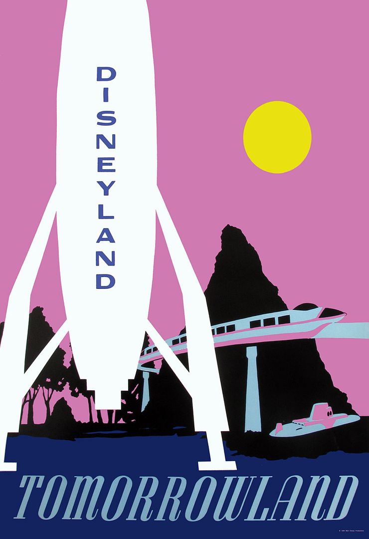
First up is this unusual 1966 "Tomorrowland" poster, which is from a set of five offset litho prints that (apparently) were sold in stores at Disneyland briefly. None of the posters are common, and complete sets can fetch well over $1000. I only have this one!
The designer seems to have been striving to emulate the graphic quality of the classic silkscreened posters, and yet it feels a little clumsy. It's interesting that the moon rocket is featured so prominently, since it would be removed in September of '66. And that color scheme, ouch; frankly it is pretty ugly. Nevertheless.... I am happy to have it!

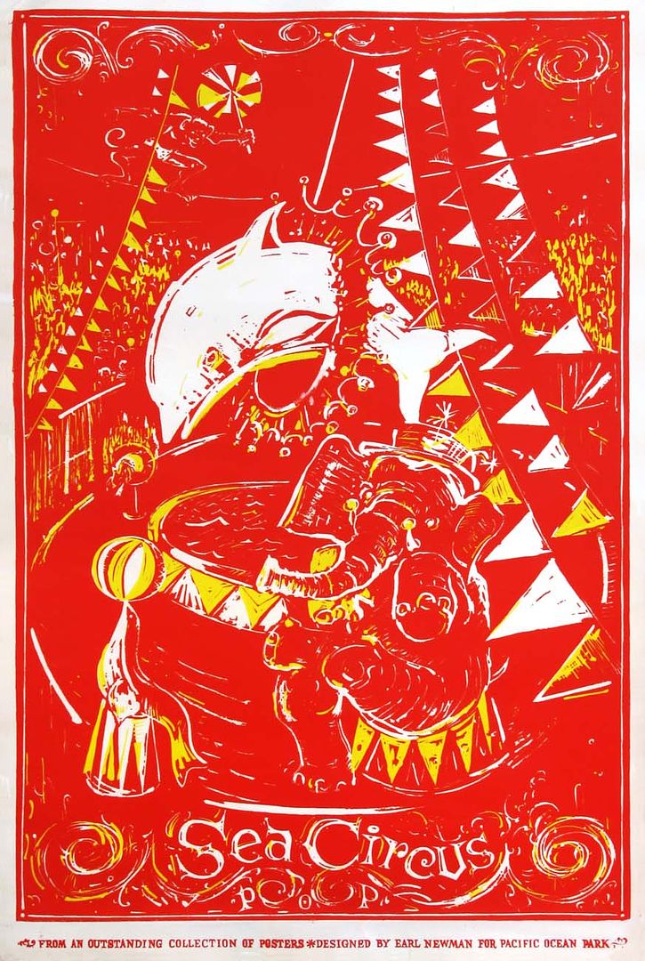
Next is this poster from Pacific Ocean Park, featuring fanciful artwork of the "Sea Circus". "From an outstanding collection of posters designed by Earl Newman for Pacific Ocean Park". You go, Earl! It appears to be a linoleum-cut print using red and yellow, and the white of the paper. I'd love to see other posters from this set, if anybody has any!


14 comments:
If it's from the same set, I have the poster from Frontierland. Size is approx. 30" H x 22" W
The Matterhorn looks good painted black!
Interesting critique Major - the Tomorrowland poster almost looks like it went to print a couple of revisions short of completion...perhaps there could have been more detail or graphics added. That said, I'm quite jealous that you own it!! Really neat!!
Bill in Denver
Hmmm, yea, that Tomorrowland poster is a bit odd, I agree it seems to be a few revisions short of being complete - but uber cool to have it!
The POP poster, well, I haven't dropped my acid yet today so I'll have to get back to you...
I like the POP poster. Very nice collection.
Oh man, those are COOL!
The 1966 Tomorrowland poster is a little ugly, but I'm sure purposefully so. Compare it to an episode of Star Trek from the same period when the crew is on a planet mission, or look at a few colour episodes of Lost in Space. The sensibility is right on with the popular culture at the time. A poster doesn't have to accurately represent a subject, it just needs to show a simple idea in the most effective way possible.
This image makes Tomorrowland seem like it is on another planet, and frankly, that's kind of groovy.
Holy colors! I think you mixed up the post title, meaning Crazy Posters! I must say I like them both, roughness and eye-gouging color and all!
On the first poster, is that supposed to be Cascade Peak in the background?
"And that color scheme, ouch; frankly it is pretty ugly."
It looks like the color scheme from the 1990's Tomorrowland refit. And yes, it is ugly.
There is at least one other POP poster featuring the rollercoaster. Same color scheme. Rare stuff!
Nanook, that sounds like it is from the same set. If I recall correctly the Mark Twain is heading in the wrong direction.
TM!, I would prefer a nice dayglo orange, but to each his own...
Bill, the set of posters is interesting because they are all so different, stylistically. Some are fully rendered paintings, and then this Tomorrowland example is about as minimal as it gets.
VDT, I just can't understand why you have not dropped acid yet. What are you waiting for?
Connie, yes they are!
D ticket, somehow the crazy color schemes of shows like Star Trek and Lost In Space (and the Batman show), as vibrant as they are, don't look so terrible to me. But I see your point!
Hannahx2, I like them too, even though they are not quite as beautiful as the classic silkscreened posters.
dfan07, since this is a Tomorrowland poster, I'm pretty sure it's supposed to be the Matterhorn...
Melissa, I know... I hate to be critical, but it really IS a bad color combo.
jedblau, I got your email with the other poster pic, thank you!
The pink sky on the rocket poster gives me the feeling of being on another planet with some unusual moons or suns and stuff....I like it!!
The Sea Circus reminds me of one of those pictures where you find things hidden within the drawing and then they made it negative, like you sometimes see an effect like that on a sci-fi movie like Barbarella or something!
Major, I meant the small mountain, to the left of the Matterhorn, and beneath the trees.
Post a Comment