A Pair From September 1978
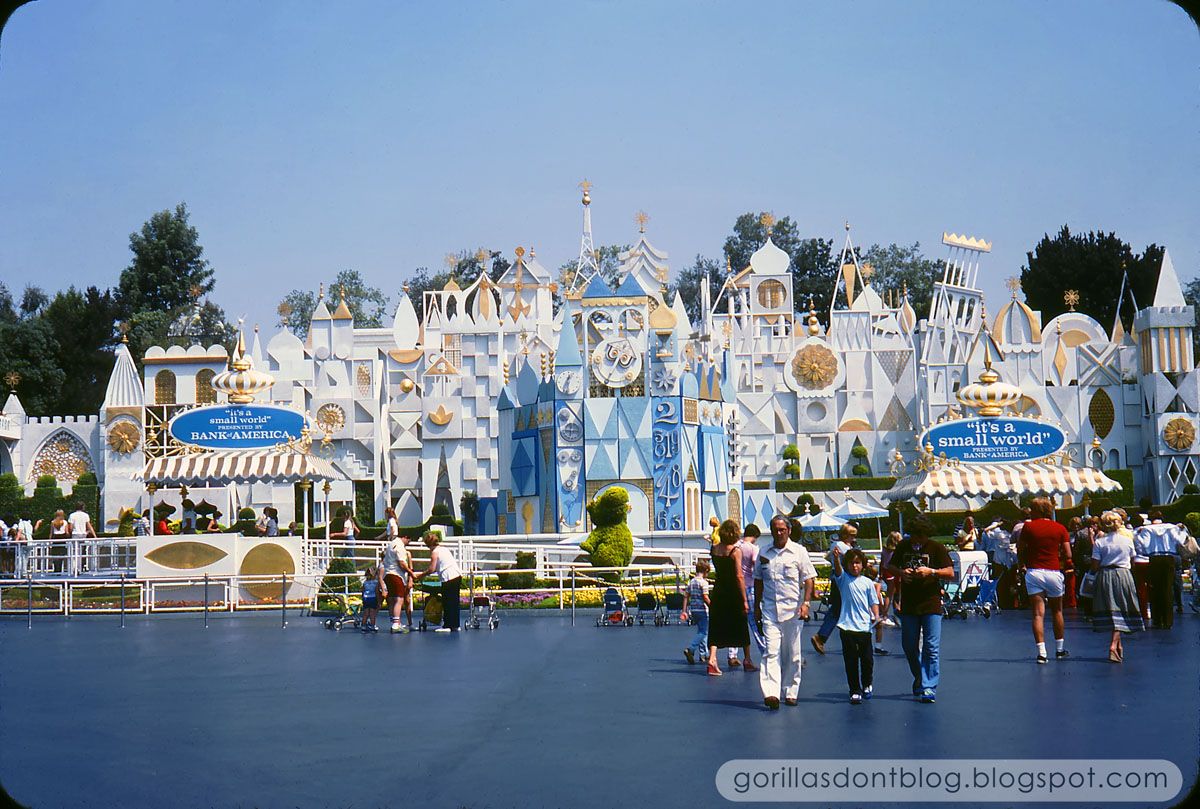
Here's an above-average photo of the exterior of "It's a Small World", circa 1978. That thing is koo-koo bananas. Notice that the all white and gold motif is already being monkeyed with; shades of blue have been added to the central portion, for some reason. Sure, Mary Blair was a genius with color, but I still think we can improve on what she envisioned. Years later, they went even crazier with a whole cavalcade of pastel pinks, yellows, oranges, and yes, even something that looked suspiciously like puce. It's true.
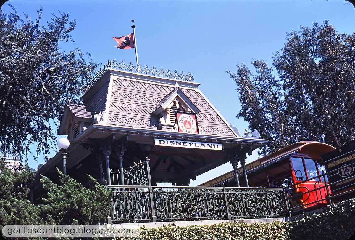
Meanwhile, over near one of the tunnels that go under the railroad tracks, our photographer stopped to take a picture of… the train? Sort of. Maybe the station? If so, it's a weird angle. I miss the Santa Fe logo… I wish that the Disneyland artists had come up with a suitably bold graphic, instead of that anemic sign.

8 comments:
I remember Blue Small World. I always thought it looked odd....sort of like they ran out of blue paint and just stopped with the clock. In the very back of the It's A Small World pictorial souvenir book, there was a photo showing the model of the clock portion of the facade and it was painted pink. I always wondered if they were taking a cue from that model with this blue version. And I didn't care for the multicolored facade that came along later. That was almost as bad as painting Space Mountain brown! I'm so glad that both attractions were restored to white for the park's 50th anniversary.
I like the sign over the station entrance better. It's similar, but instead of a castle in the center, we have the intertwined "DRR" letters. Not as cool as the Santa Fe herald to be sure, but at least it gave the railroad its own identity.
Interesting how they opened up the front view of the clock by moving the queue entrance and marquee to the right. The gold and white façade is the best, but the blue accented clock tower isn't so bad. The color blue was featured before in the marquee in front of the clock.
http://img.photobucket.com/albums/v470/bananaphone5000/GORILLA3/1-75-SW_marquee.jpg
I don't know what it is, but sometimes "it's a small world" reminds me of Walt Disney's 1961 feature "Babes in Toyland". The façade almost looks like a fantasy toy factory.
Thanks, Major.
TokyoMagic!, there is lots of Mary Blair concept artwork for "Small World" in which her façades are much more colorful. But the fact that she finally decided on white and gold seems clear that she considered it the best option. A lot of people loved the multicolor version; it's not that I don't love color, but it is easy to make something "colorful". It is much harder to make something look tasteful and yet still fun, and even elegant.
Steve DeGaetano, I do like that one a little better; I guess it is unfair to expect something as time-tested and classic as Santa Fe's logo.
K. Martinez, I can't help wondering how much Bank of America itself influenced the size and placement of that blue marquee? It's pretty hard to miss! I have a fondness for it just because of pure nostalgia, but it looks better without it. You are right, the façade does look like a toy factory!
Major - I like it better with the open view of the clock too.
If there's anything that bothers me about "it's a small world" today, it's that the open park like Small World plaza seems to have been diminished by various objects such as the towering parade spotlights, Small World Toy Shop and the offshoot entrances to Mickey's Toontown and Fantasyland Theater.
When it was off all by itself at the end of Small World Plaza it looked regal standing there all by itself.
That Bank of America sign was strange seeing as how it blocked the view of the clock. I wonder if it was removed at the same time the clock was painted blue?
K. Martinez, I agree with you. The view of the It's A Small World facade was much more impressive prior to them junking up the Small World mall/corridor with those light towers, and terraced planters and walkways. I blame Light Magic for all of that. And of course, Pressler and Eisner.
Space Mountain was brown?!?! Once again, I learned something new from this blog. Anybody have a picture of brown Space Mountain they'd be willing to share?
Matt, here's a pic of brown Space Mt. from Yesterland:
http://www.yesterland.com/brownmountain.html
Post a Comment