Snoozles
I have THREE Snoozles for you today! As you will see, the picture quality isn't too bad, the focus is within International Blog Committee (or IBC) parameters, and the lighting is pretty good. They're just boring! OR ARE THEY? You be the judge. Someone else can be the jury (I want to be the executioner).
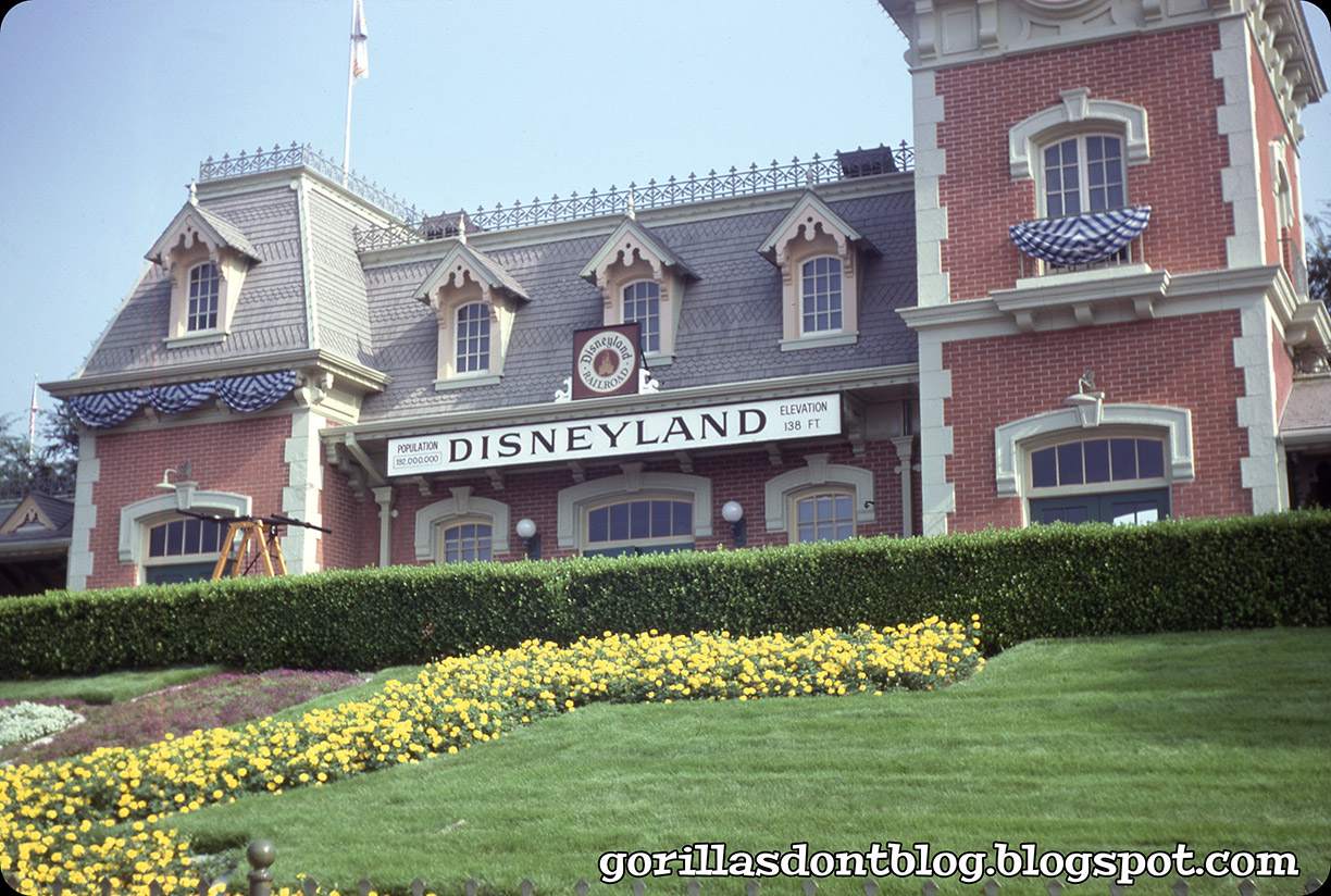
From August, 1980 comes this "meh" photo of Main Street Station. I can't even think of anything to say about it, other than I miss the Santa Fe logo.
Also from August, 1980 (but from a different lot than the previous image) comes this shot of Sleeping Beauty Castle - other than the banner for Disneyland's first quarter century, there is nothing much of note.

Here's another photo of Main Street Station, undated but I believe it's from the late 1970s; Santa Fe went out for ice cream and never came home in 1974, so we know it's from after '74, anyway. Don't hassle me, man! "Oh little bird up in the sky, whence are you coming from, and where are you going?". I wrote that all by myself, with no help from AI.


7 comments:
That bird just spotted the "dead settler" in Frontierland, and he's going to pick his bones clean. Or so he thinks.
"Someone else can be the jury (I want to be the executioner)". I am the walrus.
Well, it's not a bad photo of the Station. On the plus side, it's more close-up than most Station pics, and we can see the Handcar, or part of it. Nice lawn. On the minus side, we can't see the top of the Station, and we can see only one miserable floral Mouse ear.
Nice photo of the Castle; a blue sky helps any photo! The slight tilt of the tower adds to the illusion of great height. I'm not too keen on the 'silver' and blue banners. They remind me of old mattresses.
I think the little birdie is a not-so-little crow. Good for you for not using AI to write your poem. One can always tell when AI is used. The Station clock is actually the giant's wristwatch from Mickey and the Beanstalk.
Pretty nice Snoozles, Major. Thanks.
That “Disneyland 25” bunting on the Main Street Station in the first photo looks…odd. Probably because there’s traditional, red, white, and blue bunting in so many photos. It just doesn’t look quite right.
Painting the inside of the arrow slits on the castle the same shade of gold as the window shade is an odd choice. I would have gone with a dark color to emphasize the fact that they are supposed to represent openings in the towers, even if they were only decorative in the 19th Century fantasy Bavarian castle it’s patterned after. At least there aren’t any squirrel drainspouts yet.
JB, I’ll be the Carpenter. Call me up at brillig and we’ll do dinner. I know a good oyster bar.
In order to qualify as Snoozles, each picture must have the interest quality of at least 1/3 of a normal photo, so posting three of these means todays post achieves average interest, which is good enough for me.
The closeup views allow studying of detail that might otherwise be missed. I’m always amazed at the patterns in the roof shingles of the Station, a very authentic Carpenter Gothic treatment, and lately even more amazed that current management hasn’t simplified it to save money. Probably no one notices it in their rush to stand in line for the latest popcorn bucket. And I’m always fascinated by the Castle trim details, probably my second-favorite Park building, after Frontierland Station, so I’m satisfied with these. The bunting does look like mattress ticking though.
Goo goo goo joob, Major!
JG
That’s the International Blog Committee Interest Index (IBCII), btw. The Index reached an all-time high recently before collapsing due to tariffs.
JG
I'm with Chuck and concur that the 25th Anniversary colors seem odd....kind of like the purple colors of the 100th WDCo banners....I had these inner thoughts in 1980 as well. I get it: Silver Anniversary...but these things kind of take me out of turn of the century Main St. vibe and into the present day....I'm not sure those colors, or all the orange stuff for Halloween would not (speculatively) have been used then. However, I know people love their highly saturated colors and so be it. A friend sent me a 1980 photo of myself today, and it took me back to these blue and silver days. I remember during my on-stage orientation tour, the "Disneyland is your Land" parade was going on, and my group was all giddy. That tour was mostly about "this is where the break rooms are and the Inn-Between, etc." (there were several tours and classroom events over the course of two days.) There are (were) a lot of break areas backstage: one of the people in my group stated "wow...there are a lot of places to take a break..we must be about to get really tired!" (understatement of the moment...) the tour guide (Tomorrowland merchandising employee) said that the reason there were so many break rooms is when Ronald Reagan was Governor of CA, there were laws around break areas being male only and female only...hence...many break areas. Today's training (it seems from my observation) involves employees standing out in the park in line-ups, about 6 ft from each other waving and smiling at people (strangely, and creepily). I'm not sure what this is meant to do, other than make the employees feel super uncomfortable...and make the likes of me feeling surveilled. But have at it Disney U. It's true...you get really tired working at Disneyland...in the beginning anyway...then you build up some tolerance. You look forward to your break time working in foods, and as one executive said: "If you work in foods, you can handle anything in the Park." And he was right. Thanks Major for the 1980 memories.
TokyoMagic!, the settler’s meat is aged to perfection!
JB, walruses aren’t real! Come on! Those crazy tusks? No way! None of these photos is really so bad, but as I said, they are unremarkable to the point of being boring. I’m with you, I’ve never really loved the silver and blue for that 25th anniversary, but I guess that would be the silver anniversary? Not sure to be honest. I would use AI for poems, but I tried to get it to rhyme with “orange”, and the entire eastern seaboard had a blackout. Oops!
Chuck, I agree, classic red, white, and blue bunting would have been better than that blue and silver stuff, but nobody asked me. They never ask me! I did not notice the gold paint inside the arrow slits on the castle; a terrible choice, even in 1980?! I thought that sort of thing didn’t happen until much later. Oysters, yarg - does anybody actually chew them, or do they swallow them as quickly as possible to pretend the whole thing never happened?
JG, thank you for spelling out the complicated (but fair) rules for Snoozles, which many have not memorized for some reason. I love the shingle patterns on Main Street Station’s roof, and worried that they would cheap out and not use them when the station was recently fixed up. Thankfully, they kept the patterns. Gosh, what is my favorite park building?? Maybe the exterior of the Haunted Mansion, but that’s just off the top of my head.
JG, luckily I bought whatever the hell I was supposed to buy when the IBCII went back up.
Bu, warm colors are known to be “happier” and more celebratory, even kids with chicken pox know that. I’ve mentioned my knee-jerk dislike of purple before - especially since Disneyland falls back on that color in so many instances for some reason. People really do love saturated colors, even if they are way over the top, which is why Disney puts them everywhere now. It’s a quick way to indicate that changes have been made. Ha ha, “…we must be about to get really tired”… an astute observation. I don’t mind the smiling and waving on Main Street when the park opens, though it isn’t really necessary - we’re already happy to be there. But it does no harm. There might be something to the idea that “we have our eyes on you”. “If you work in foods, you can handle anything in the park”. I believe it! I’ve watched those poor, hard-working employees, and wished for something better for them.
Post a Comment