More Fantasyland, 1983
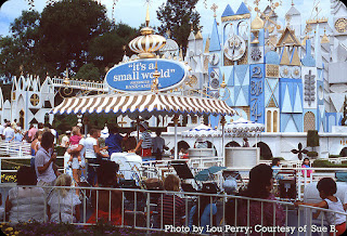
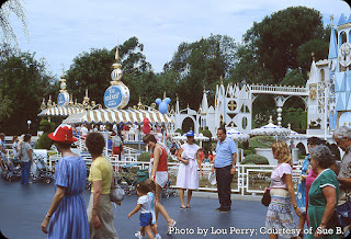
I have a nice batch of Fantasyland photos courtesy of Lou Perry and Sue B. today, let's take a look! The first group shows all of the hubbub in front of the It's a Small World attraction. As you can see, cosmic rays have turned part of the façade shades of blue. It's like the buildings of the world have been plunged into a polar vortex!
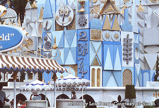
As we have seen before, the number 8 is missing from that panel. Maybe it fell off, right into a passing boat. Finders, keepers!
I linked to this photo in a previous post, but here's what it should look like (from a 1966 image) with all of the numerals.
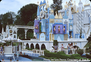
When I was learning how to paint, I had a teacher who had unkind things to say about the overuse of the color purple. Of course it is a fine hue, but in animation (I was learning how to paint backgrounds) and apparently in theme parks, it started to be used a LOT. Thanks to years of brainwashing, I now feel my hackles rising when I see too much purple. I will never seek treatment!
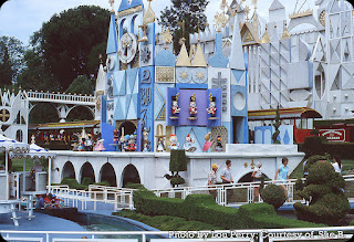
In spite of the purple, I have always loved that fanciful mechanical clock with the regimental drummers and the rows of costumed dolls marching out of the building. They didn't need to add that feature, but it sure made waiting in line a lot more fun. Notice the Disneyland RR passing by.
People! And strollers. But not too many strollers. Maybe a dozen, rather than the scores of them that can be seen proliferating near some rides. Like rats! Only you can push babies in them. OK, maybe it's a bad metaphor. I haven't had lunch yet.
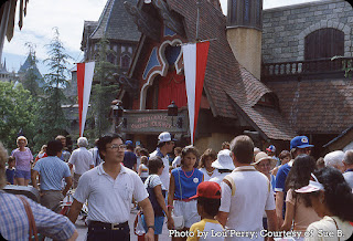
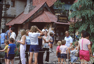
Now we've moved over to the very busy "New Fantasyland". More strollers! And people in shorts that are shorter than I'd like. Does anybody know that sweeper? Is it Smitty from Lompoc? The long line is for "Peter Pan's Flight", I think I've waited in a line that bad.
"Pinocchio's Daring Journey" was a great addition to the Fantasyland dark rides, though it doesn't seem to be quite as beloved by the public as some of the others. What do they know! Above that balcony is a little proscenium; nothing's going on there in September of 1983, but eventually the marionette version of Pinocchio would wiggle around up there.
Waiting in line, it's all a part of being in Disneyland. Somehow it didn't seem so bad when you could do all of your favorite rides in one day!
A big THANK YOU to Lou and Sue!!


20 comments:
Major-
Yes, a big thank you to Lou and Sue. And a happy purple Monday.
What a great bunch of LouPics®. They capture the essence of what it's like to be wandering around in Disneyland.
If you ask me, there's no such thing as "too much purple". Next to deep, saturated blue, it's my favorite color. No wait... AhhHhhHHh! [JB gets tossed into the Gorge of Eternal Peril, below the Bridge of Death.]
Thanks to Lou&Sue&Major (all one word). Such happy, pleasant photos.
This sign in front of small world doesn’t obscure the facade. Wonder why it took so long to figure that out? Or maybe the question should be “wonder why it took so long for the sponsor to finally agree to an environmentally-appropriate sign?”
I spent a lot of time looking at those New Fantasyland pictures trying to figure out what could improve those scenes when it finally hit me what was missing - a rhinoceros stampede.
Thanks again, Lou & Sue!
On one of my last visits to Disneyland, we found the best time to visit Fantasyland—to go on all the dark rides—was after dark and about an hour or so before closing. By then, most all the families with kids and strollers [and bubble blasters] have gone home. Lines are super short and everything is so pretty at night. Best time to be there!
Sue
Major, I meant to ask you what your teacher taught you about purple. Just curious. My guess is that it’s an ‘over-powering’ color and takes away from everything else.
Sue
My great-grandmother had a saying, once she passed a certain age, which now I can't remember specifically what age that was. Maybe 70....or 80? Anyway, she'd say, "Now I'm old enough to cuss and wear purple!" She never cussed, but she did wear purple.
Thank you, Lou, Sue, and the Major, too!
While I think I like the all white & gold version of the facade best ( technically it has never been just white and gold - blue was used for the inner doors and a cream color was used on inner reveals and recesses of the facade’s shapes and openings.) but I really like the facade color scheme in todays pictures as well. And I didn’t mind the 1990’s sherbet scheme either …. But I was really glad it was returned to the white & gold facade in 2005.
The 1983 It’s A Small World attraction poster created for Tokyo Disneyland actually was developed with Disneyland CA in mind … the whites blues and purples used on the facade was used on the 1983 attraction poster. Tokyo’s facade has some of these colors as well as reds and creams. Like most of the Tokyo Disneyland attraction posters , the artwork was duplicated for Disneyland and Walt Disney World when appropriate, but in 1983 Disneyland was the only American park to get the “Tokyo” small world poster - but it wasn’t displayed very often - but they are out there! Walt Disney World eventually got the “Tokyo” 1983 style small world poster around 1996 ….. and was the very last attraction poster screened at WDI … 4 blank 1983 Tokyo posters ( they are called “generics” and usually only feature the attraction title ) the new Walt Disney World logo was added as well as re-used screen from EDL’s small world poster “Fantasyland”.
The very last Disneyland silkscreened poster was in 1993 and it was also a it’s A Small World poster that used the 1992 EDL artwork and Mattel sponsor . This version of the poster was used at EDL , DL and WDW and is called the “Precious Moments” Small World poster because of the revised Paul Hartley /Mary Blair children that very much resemble the ceramic figurine gift line of Precious Moments.
There have been more variations of design for the It’s A Small World attraction poster than any other attraction poster - with over 9 different designs having been used.
Ah the 80s! When my Park visits resumed after a 15 year hiatus.
I would have been in that crowd leading a family just as young, pushing strollers just as small, wearing shorts just as short :P
Lou's pics are always the best!!
Thanks to Lou for taking them, Sue for sharing them and our esteemed leader for posting them!
Lou and Sue's pics are ALWAYS a special treat. Love these Small World facade pics. I always loved how "it's a small world" was off by itself in its own little sub-section of Fantasyland. Those days are passed. Thanks Lou & Sue and Major too.
Thanks Lou, Sue, and Major for fine pics of one of my favorite facades, just as the 80’s fixed their grip on fashion. Gold and white was best, a little blue was ok for relief, but the Spumoni version was a Bridge too far. I guess it bugged me because it reminded of Michael Graves craze in architecture about the same time. I’m glad we have returned to white (with lavender accents).
Chuck, I like this signage, but to be fair, that facade is such that almost any sign competes with the building.
Major, I didn’t get the Purple Admonition, but used it only on sunrises and sunsets. I included a lavender tile once in multicolor mosaics around drinking fountains and over windows etc. it’s a touchy color in fashion though.
Mike, thank you for the poster info! My mom was a Precious Moments nut. I miss her, but not those, or Lladro either.
I think the Geppetto shop must have disappeared when the Tangled addition was done?
Sue, late evenings and during shows are the best times to rack up rides, for sure.
JG
I have both negative (Barney the dinosaur) and positive (Journey into Imagination, Donny Osmond’s socks) associations with purple.
Nanook, Prince would approve!
JB, hey, YOU can like purple! It’s a fine color, it just gets overused in certain settings. Like at Disneyland.
Chuck, I dunno, that ugly souvenir stand (?) wit h the sign on top of it is pretty ugly, if you ask me. And you didn’t! It blocks the facade in its own charming way. I do like a good rhinoceros stampede…
Sue, it’s true, that last hour is the best!
Sue, the class was specifically about painting backgrounds for animation, and the teacher showed classic background paintings compared to newer examples. The newer ones almost always had LOTS of purple. As if the theory was, “When in doubt, use purple”. I later saw a website that was also “anti-purple”!
TokyoMagic!, I’m trying to think if I have ever owned any purple clothing. I don’t think so, though I had some blue sneakers that turned purple after my mom put them in the wash. I got lots of Donny Osmond comments.
Mike Cozart, I know that the facade was not just white and gold, but that was the overall scheme, with a few variations. I don’t feel like the blue seen here does it any favors, but that is totally subjective. I’m sure other people loved it. The sherbet look kind of amazed me because it seemed like it would be very expensive to maintain, having to have so many hues on hand. I wonder if that’s one of the reasons it was returned to its classic look? I don’t know if I’ve ever seen the Tokyo Disneyland version, maybe I have? Interesting about the posters, I love all of those details! Now I’ll have to look for that “precious moments” version of the IASW poster, I do know that that attraction had many variations of the same general concept. Of course my favorite is the original.
Grant, if only you showed up in today’s photos! Why did you take a 15 year hiatus? Was that when you were a ninja?
K. Martinez, it always amazes me at just how much real estate is devoted to IASW and the big plaza in front of it. It’s relatively huge!
Bu, I can imagine that there were many bugs to be ironed out (mixing my metaphors) in the early days of the New Fantasyland. Especially with the long lines full of people who wanted to see the refreshed classic rides! Funny about the sideburns regulations. I picture a 3-inch thick booklet with all sorts of insane, detailed descriptions of what was and was NOT allowed. I’ve never seen the sweepers making those wet drawings, though I’ve seen photos of them doing so. Hey, maybe those simple drawings will make a child happy, that’s not a bad thing. At least it’s an “extra”! I don’t hate the blue on IASW, but it feels weirdly “frosty”, as if Anna (or is it Elsa?) lives there. I had a friend who worked at the park during Donald’s 50th, so she got me quite a lot of pinback buttons and other stuff. Most of it is gone now, I couldn’t keep it all. I recently learned that the Grimace was supposed to be a taste bud. If so, why give him a name that sounds like a person has eaten something unpleasant?
JG, it seems as if Walt, Mary Blair, Rolly Crump, and others all had some sort of elaborate facade planned for IASW all along. Better than a big plain industrial shed, which is what the building basically is. Ha ha, yes, Michael Graves loved color, though I always associate more primary colors with that style (“Memphis”?). I acknowledge that it is dumb of me to dislike a color, and I don’t really dislike purple, it’s just the way it has been misused in animation backgrounds (I’m talking television animation, BTW). I had a friend who had a Peter Pan Lladro, it was her pride and joy. It was nice, but I didn’t covet it.
Melissa, see? Donny Osmond! I kind of like Barney because he bothers so many people. Just like me.
Major, I noticed the new font. Trying something new?
Thanks, all, for your kind comments. My dad will love them.
Sue
You said it Major....Back in the day when you could see the full park in a day...albeit a long and pleasurable one. A day of spontaneity, not pre-planned 6 months before arrival. What's the fun in that? Sadly, many will never know. With all the best wishes to Bob Iger to re-right the ship! KS
Grant, if only you showed up in today’s photos! Why did you take a 15 year hiatus? Was that when you were a ninja?
You guessed it Major. They wouldn't let me in with my sword. And as we all know, ninjas never go anywhere without their sword!
Old enough that I still think of IASW as sort of a separate place from Fantasyland. It was too big and 60s modern when the area was still a 50s-flavored medieval carnival; then New Fantasyland brought the period architecture of the films and a sort of Real Place-ness, again much different than what IASW projected. The imagineers do include this in their design calculations. The train passing through ties it to Disneyland and the clock elevates it from a mere billboard for the ride.
You kids who grew up with it there don't feel an incongruity, just as we all accept the medieval castle that's always been at the end of Main Street.
My take on Pinocchio's Daring Journey: It feels a little too dependent on knowing the movie, whereas on the other dark rides any story points are simpler and clearer, or they don't really matter. On Mr. Toad's Wild Ride you're an out-of-control driver; Snow White is a mix of pretty scenes and scary ones; Peter Pan is about flying over fantasy scenes; and Alice in Wonderland is cruising around a crazy place until the Queen of Hearts gets mad at you. Knowing the films is nice, but not necessary.
Lou and Sue, I honestly have no idea why the font is different today. I assume I “did something”, but if so it must have been an accident. Hopefully tomorrow we’ll be back to normal!
KS, yes, the pre-planning thing is a real drag, but I do know that you can still do a lot if you get a little lucky. Even without the Genie+ app! Yes, I hope Bob Iger manages to do some good. I wish I was more optimistic about it.
Grant, it was really the only explanation!
DBenson, IASW really is sort of set back away from the rest of Fantasyland. The area IS awfully big. I still wonder WHY. There must be a logical explanation. And Walt was still around when IASW opened, so he was involved in the planning. I’m sure you’re right, kids who have seen it their whole lives don’t think twice about it. Maybe you’re right about “Pinocchio’s Daring Journey”, but don’t all of the dark rides loosely follow the movies? I never really thought about Pinocchio being that different.
Lou and Sue, I FIXED IT!
I can confirm Sue's advice on Fantasyland rides. I was there last Wednesday and got 8 rides in the last 90 minutes (Mr. Lincoln, Canal Boats, Alice, Peter Pan, Mr. Toad, Snow White, Casey Jr., Pinocchio). It was pretty great with the rides walk-ons at that hour.
Bountiful batch of beauties today.
Post a Comment