Blurry Instamatics
I have been having so much fun scanning the hundreds of Instamatic negatives that were given to me by "Mr. X"; the collection has been a real treasure-trove. But I suppose it is inevitable that some of the pictures turned out less than perfect. They're not a total loss though, which is why I am sharing some of them here.
Peace out, man! That kid is totally groovy in his tomato-red Autopia car. I am grateful that he didn't use a different gesture. Just above his head, an aqua Peoplemover train passes by, with a tour guide in one of the vehicles. It's strange to see the track dip down so low to the ground!

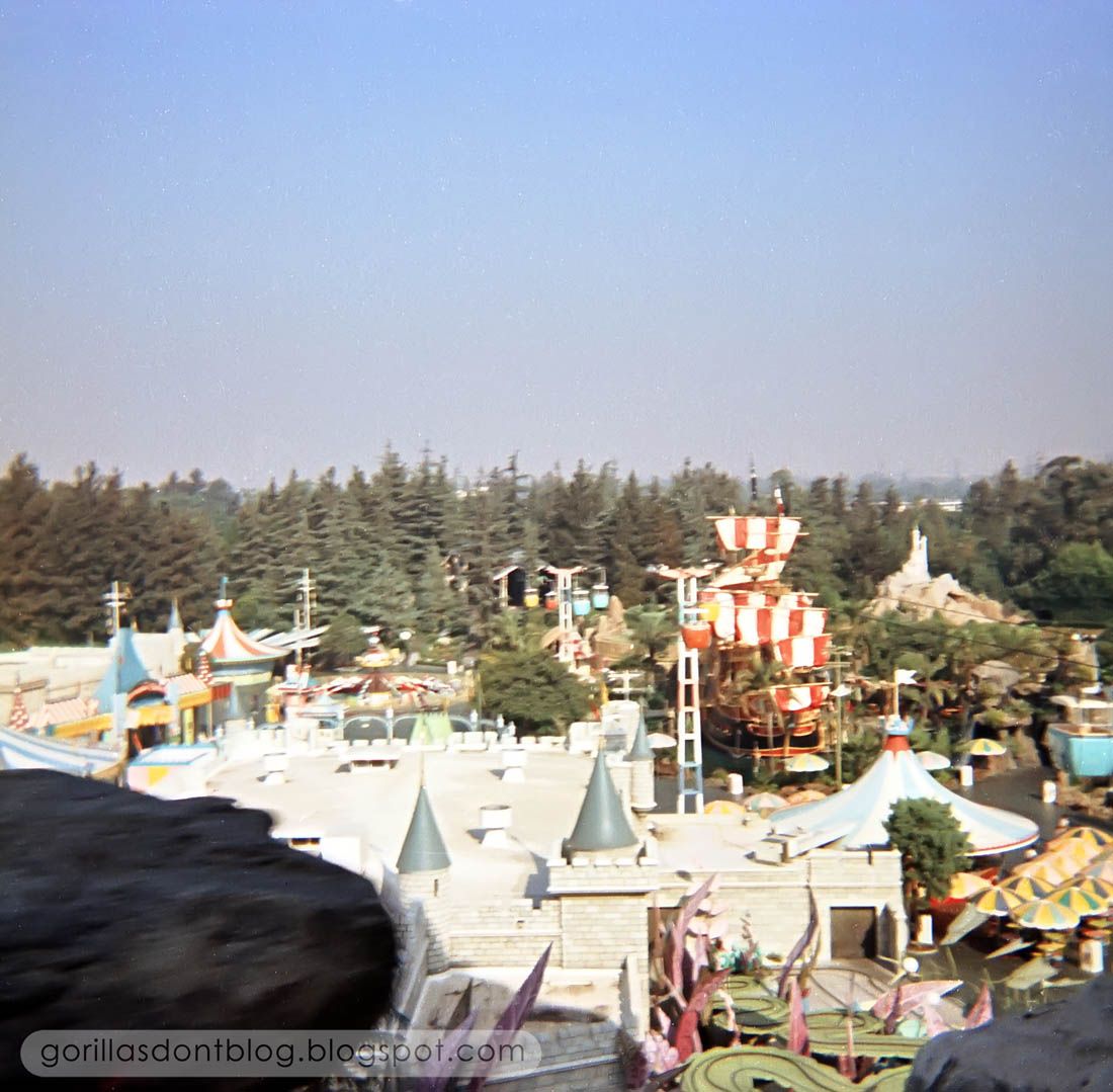
Considering that this photo was snapped from a speeding Matterhorn Bobsled, it came out surprisingly well. Fantasyland can be seen below us, spread out like a table-top miniature.
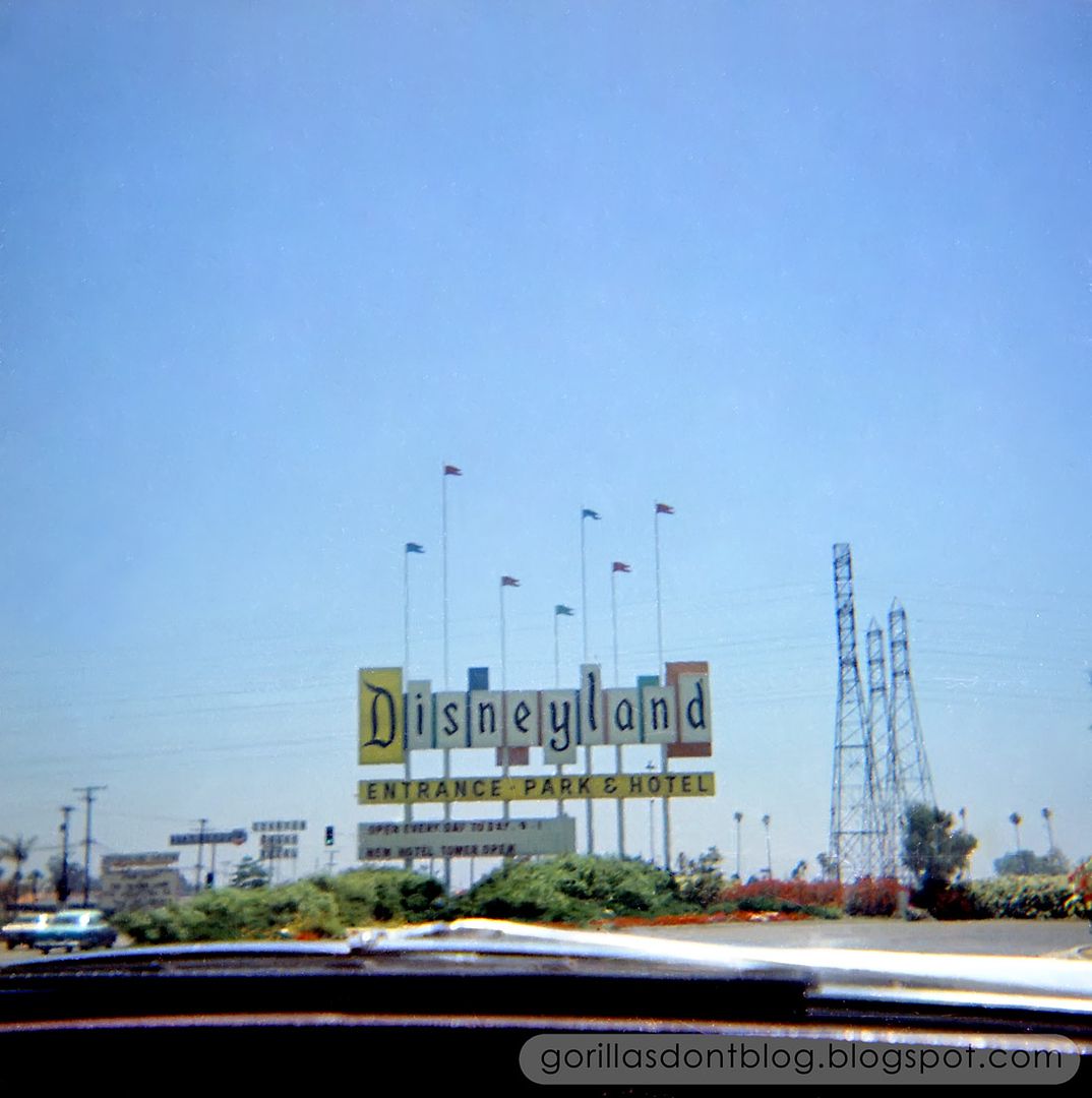
You can't have too many pictures of the old Disneyland sign! This one was shot from within mom's car. The sign says that there is a new tower open at the hotel, but which tower? That would help to date this photo if we only knew.
Aaaaannnd, another one taken from inside the car as we pass Main Street Station. Yes, it's blurry, but I still get a kick out of this view. Mickey's smiling face, the Disneyland Railroad, and the Matterhorn all make cameos.

I have more blurry rejects to share one of these days!

9 comments:
That last shot looks like from the nosecone of the monorail. The angle of view looks quite high for a car since you can see the ticket booth flags below the window. That would be one groovy car to have that kind of window!
Sam, boy do I feel dumb! Of course you are right. I was just so in "car mode". Thanks for the correction!
It kind of looks like the kid in the first picture is making the peace sign with both hands. Is that how they did the "Look, Ma, no hands" thing back in the late '60's? Or is he doing the "How many fingers and I holding up?" test to some poor dope who stood up going under the low Peoplemover track and conked his noggin? If it's just a garden variety peace sign, I hereby rename that section of track the Peacefulmover.
Is the person taking the picture turned around in the car ahead of him, or zoomed in from the sidelines? Best buddy? Mom? Pesky sibling? If this boy grew up to have kids and grandkids, I 'm so glad they have this memory. Maybe they went on to fight like cats and dogs the rest of the day and never spoke to each other again, but damn. They still had this one, perfect, sun-soaked moment. Yeah, I'm feeling a little sentimental today. Must be the hazy pictures makin' me feel all blurry-eyed and stuff, like a Folger's ad at Christmas. But this is so much of that I come to GDB for - to share other families' happy memories.
And then, as soon as the camera shutter closed, the pretty tour guide turned around and tossed her cookies over the edge of the track.
Blurry or not, I'm loving today's instamatics.
One of the things I preferred about Disneyland's Goodyear PeopleMover over the WEDway PeopleMover in Florida is that Disneyland's changed elevation throughout most of the ride while the Magic Kingdom's PeopleMover remained flat throughout. I'm not sure if it was due to the technology used (motorized tires in embedded the track vs. linear induction) or due to the structure in which Florida's roof was built into the track itself and not the vehicles like Disneyland's.
@Melissa - I remember back in the day when President Nixon used to always make the peace sign with both hands.
Some neat stuff here, Major.
That Peoplemover shot is a part of the ride I remember well, the track dipped down until it was almost at Autopia elevation, then back up. Really emphasized the 3D aspect of that whole forested section.
The photo of the TL Skyway station you posted several days ago was taken from this part of the Peoplemover track, today's pic is an almost perfect "reverse angle" on the earlier shot. Very cool combination.
Who had presence of mind enough to take a picture from the Bobsleds? They should get a medal for that one. And a reasonably good picture at that. I have several shots from that angle, but none from so high up. From the empty Skyway buckets and lack of crowds below, I bet they ran right to the Matterhorn and rode it first, just like I still do.
Oh, the Sign, the Sign. What a rush of emotion associated with the first glimpse of the Sign. Were all these pictures from the same batch, taken at the same time? We can take a guess at the date and figure out which tower. The only cars visible look pretty old model. May have been the first DLH tower since the hotel was low rise only for the first few years.
I wish we could see the parking lot, Thufer would like that.
Last one is definitely from the nose cone of the monorail, front or back I cannot tell for sure, but guessing front and inbound direction since the buildings look close and the outbound track was further out. The overhead shadow arc and the center glass divider are pretty plain. All my years of visiting and I have NEVER gotten to sit in the cone. Over 50 years of envy in this one for me.
A wonderful mix today, Major, fuzzy or not, I love it.
JG
Some of my favorite pictures of WDW are of The Big Sign taken through the car or bus window. I never got one of the Disneyland sign because I wasn't sure where to look until it was too late!
In fact, some of my favorite vacation pictures in general are "through the window" shots.
As to the illusive date of the sign, first of all, the original "Disneyland" sign didn't appear (oddly enough) until 1958. Second, the first version of the sign had the familiar changeable letter section, below the "Disneyland" letters, consisting of "white" plastic, trans-illuminated backing, allowing for changeable letters (red/black) to be placed in front of the backing - as can be seen into today's post. That changed to a black background, with yellow, changeable letters, sometime in the early 1970's. (Does someone know a more precise date-?)
In 1975-? the yellow "D" was replaced with a white "D" and Park & Hotel Entrance was replaced with America On Parade. And then again in the 1908's to: The Happiest Place On Earth. In 1989 the first of the more "modern" and perhaps more consolidated-looking signs appeared, doing-away with the (movie marquee-style) changeable letters and incorporating computer-driven light bulbs to create the letters/images.
But that doesn't exactly establish the date of the picture, other than some time between 1958 and 1975. (So much for being a sleuth). If I had to bet, though, I'd be thinking it's the Sierra Tower - the first one - 1962.
Melissa, I can't tell what that kid is doing with his other hand, and don't want to know. I'll have to ask Mr. X if he knew that kid or if it was just a random shot of the Autopia. There are some other photos (of Dumbo's Flying Elephants, for example), that also appear to be taken of specific kids. The odds of this kid (or his family) seeing this photo is about 1 in a kajillion!
K. Martinez, these are still worth a look, in spite of the lack of clarity. I didn't know that the Florida Peoplemover stays flat… what a bummer! As you suggest, it must be because of their different mode of propulsion.
JG, until I saw some of these Instamatics, I honestly had not remembered that the Peoplemover got this close to the ground. I have a few pix taken from Bobsleds, and most of them have been surprisingly good. And these photos are a complete mishmash of dates, from the mid-1960's up to possibly the early 1970's. Have you spoken to Thufer recently? He seems to have vanished.
Melissa, one thing that surprised me about that Monorail shot is the fuzzy "velour" surface of the lower walls. I certainly wouldn't have expected that!
Nanook, I wish I had some more concrete history on the DL sign… you certainly have been paying a lot more attention than I have! I know I wasn't crazy about the 1980's sign, but maybe I was already a stickler for tradition.
@ Major-
I can't describe it particularly-well, either, but the original sign seems to be unique and differentiated itself from others of the day. And the newer versions have had difficulty capturing any of the spirit, energy and simplicity that has made the original(s) unmitigated classics, and the current group of designers seem unable to repeat that greatness.
As has been discussed many times: If it doesn't "scream" in some fashion or another, it will likely not pass muster at Disney. Everything the Walt Disney Company does these days, seems to be by necessity, over the top, with little to show for it. That could explain the 'blahness' and boredom of the current signage.
Post a Comment