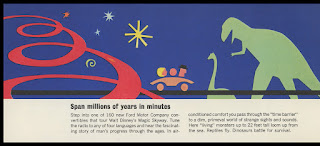
"Magic Skyway" brochure, 1964 New York World's Fair
One of my favorite brochures from the 1964 New York World's Fair is this example from Ford Motor Company's "Magic Skyway". It's not terribly rare (after all, the Ford pavilion was one of the more popular destinations), but it has wonderful graphics.
First lets take a look at the cover; the art is pretty abstract, especially with no context, but one might get the impression of roads curving through the air, past a Jetsonian, futuristic building.
The thing unfolds to a somewhat unwieldy length, but that is part of its charm. Don't worry, I'll zoom in on each panel individually.
There's the fabulous Ford Rotunda, looking like the bones of some alien creature (or like a crown roast). Mom, Dad, and their balloon-headed child are in for some fun.
Part of the queue took guests past the International Gardens, which (as you can read for yourself) featuring 11 miniature tableaus "Designed with Disney detail". Check out that Magic Mirror too.
You can check out cars of the past and future, including some of Henry Ford's early racers. I like the mention of the Auto Parts Harmonic Orchestra, which was designed by my personal friend, Rolly Crump.
Flipping the brochure (or is it a flyer?) over, things get even more interesting.
Now we're on the actual Magic Skyway ride, sitting in your late-model Ford convertible and listening to narration read by Walt Disney himself. See some life-sized dinosaurs!
Like the "Rite of Spring" sequence in "Fantasia", the dinos are wiped out by drought, volcanoes, and high-fructose corn syrup. And while it was sad to see them go, their absence allowed for the development of tiny sea monkeys into grunting cavemen. Alien forces compel them to carve wheels out of stone.
Leaping forward in time by hundreds of millions of years via a Time Tunnel, you wind up in "fabulous Space City", which is where I want to live. You can find artist's concepts of Space City online, but I've never seen an actual photo of what it looked like.
I hope you've enjoyed this wonderful brochure!


14 comments:
Major-
Such wonderful graphics; simple yet delightfully colorful, fun and inviting-!
(Evidently, air-conditioning was a big deal, here).
Thanks, Major.
Major,
Another absolutely brilliant post! I love the bold and un-apologetic graphics used here. Very 1960's, in a way that no self-respecting company would dare use today... which is a terrible, terrible shame.
Extra bonus points this time for coining the term "Jetsonian"! The purist in me might cringe a bit at what Hanna-Barbera did to animation in the late 1960s through the mid-1980s (well after their time with the genesis of Tom and Jerry, which is an all-time favorite), but the piece of me that grew up in the latter part of that time immediately made me want to watch an episode of 'The Jetson's', 'The Smurfs' or even 'The Flintstones' after I read that screams "THANK YOU!!".
Another fantastic post!
-AlbinoDragon
P.S. 7th frame. Is that T-Rex about to eat that Diplodocus that's going to trample the lovely family in the 'future-car"? Say it ain't so!!
(That said, in frame 8 and 9, they clearly make it past the volcano and the cave-people and well into the future, so hopefully we get to meet them then!)
Another upvote for "Jetsonian!"
The art and design are absolutely gorgeous - it still looks fresh and engaging 50 years later. It's of its time, but not dated.
The international gardens sound pretty cool, too. Kind of a combination of Storybook Land and World Showcase.
The things I remember most about the Worlds Fair are Carousel of Progress, The Polynesian style pearl diver pool, and the Ford Exhibit. Hey, I was ten. I had just as much fun flipping baseball cards with my brother David in the hotel. I am not surprised Walt had his creative mitts all over the Fair. The graphics here are late mid century coolness and I love 'em. Thanks for sharing them Major.
@ AlbinoDragon, If you want to see animation that will make you cringe, check out Clutch Cargo, almost the only thing that moves are the creepy lips.
Cool stuff! I could go for a new Tomorrowland that is mid-twentieth century World Fair-ish. Thanks, Major.
The only thing I remember about riding Ford's "Magic Skyway" was being disappointed that we didn't get to ride in a Mustang. I think we got a Fairlane or a Custom 500. Dennis- Levittown NY
Yes, the graphics on this are beyond fantastic! I wonder what happened to those miniature buildings from the International Gardens. Walt loved miniatures. I wonder if they could have been stored somewhere for a while, or if they just got thrown out as soon as the Fair was over?
Agreed, three cheers for "jetsonian". Hip, hip, huzzah, etc.
I thought the dinosaurs were done in by plastic straws?
Major, we will get to Space City and find it populated by Jenny Agutter look-alikes wearing the Moonbase costumes and purple wigs from UFO.
JG
Nanook, it’s hard to beat those mid-century graphics!
AlbinoDragon, this is one of those 1964 World’s Fair brochures that is a “must have” - if collecting is your thing. Plus these tend to be fairly reasonable in price, being fairly easy to find. “Jetsonian” is a term I have heard before (I see it is listed on Wikipedia), as much as I’d like to take credit! I know what you mean about Hanna-Barbera, and yet those early years and characters have a lot of appeal for me. The artists who were involved created a lot of very pleasing designs, and I love the colors used for backgrounds (though they eventually lost their way and the colors became really awful). I’d like to believe that T-Rex and diplodocus (perhaps still “brontosaurus” at the time) were best friends, sort of the Oscar and Felix of the era.
Melissa, I think that the best designs, even if they evoke their era, definitely still appeal years later. It seems that styles will go through an unfashionable period, and then people will realize that they were pretty great all along.
Jonathan, you were so lucky to have gone to the Fair; I sure wish I could have. At ten I was already getting very interested in Disneyland in a way that probably seemed excessive to my parents, so I think that a trip to the Fair would have been a life-changing experience. “Clutch Cargo”, ha ha - it is cringe-y, and yet I love how cheesy it is.
K. Martinez, YES, I would much prefer that kind of Tomorrowland, even though in theory a “steampunk” land should be cool.
dennis, these days I’d be OK with a Fairlane! In fact I saw one on the road the other day and thought how great it looked.
TokyoMagic!, that is an excellent question, I also wondered if those buildings survived in any form. My guess is that most of that stuff wound up in a landfill, as much as it hurts to think about it. The temporary nature of World’s Fairs is part of their appeal, but it sure seems like a ton of work and creativity just got destroyed way before its time. At least Walt figured out a way to reuse the stuff that his people designed!
JG, “Jetsonian” makes me think of Frank Lloyd Wright’s “Usonian” houses - though of course the terms have nothing in common. With all of the talk about plastic straws, I actually have made a small effort to use less of those things. Turns out it’s not so hard! But sometimes you just have to have a straw. 40 points for the Jenny Agutter reference.
Major-
I have a shadow box 'Harmony Lantern', as the manufacturer calls it, which uses the heat generated from a small lamp to turn an insert - of varying designs - the images being projected on the rice paper surfaces of a square frame surrounding the rotating insert. One of their designs uses dinosaurs, and I was reminded of it as soon as I looked at the brochure. LOOKIE HERE
I never saw the fair, but I was only two to three years old at the time, so even if I had I wouldn't remember it. I DID see the 1968 Hemisfair! Also, my mom drove a light yellow 1966 Fairlane (alas, four door, hard top). That's about all I got for today, I'm afraid...
Nanook, that "Harmony Lantern" is pretty cool, and I can definitely see a family resemblance! Thanks for sharing.
Stu29573, I think the first Fair that I was truly aware of was "Expo '74" in Spokane - we had a school magazine that had an article about it. As expos went, it was pretty small. And I was aware of the HemisFair because I liked the postage stamp that was released at the same time (the western hemisphere in pink with spirals emerging from San Antonio). I still have some of my mom's HemisFair stamps!
As everyone else said, these graphics are truly amazing! Imagine stuff like this on today's theme park marketing material. It seems that today's promoters want to think that people desire clear-cut pictures that show you exactly what you'll get (Either that or they don't feel like hiring artists). If promoters started using stuff like this, I'd like to think that they would be surprised at the public response.
I also like the somewhat disjunctive sense things seemed to have in old World's Fairs. International Buildings? Eh, throw them in there! It's almost like those old educational cereal box prizes - fun products of the time, but also educational in a sort of hidden way.
Closest I've come to a World's Fair was the Canadian National Exhibition. I have a vague memory of some kind of space travel simulator.
Post a Comment