Scenes From June, 1970
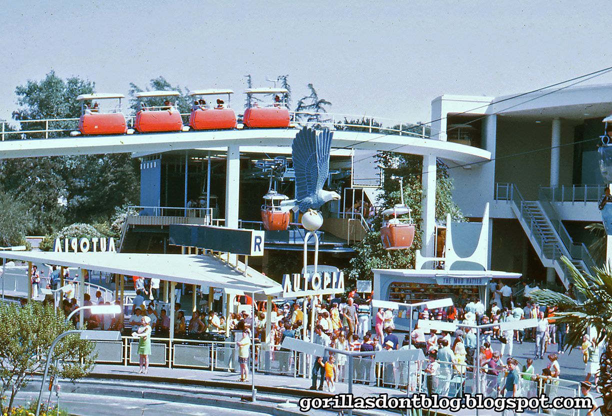
June 1970 was a great time for Disneyland, as evidenced by today's photos! Just look at this beautiful view of Tomorrowland, with the Skyway (and the Tomorrowland Skyway terminal), the Carousel of Progress, the Richfield eagle, and the Autopia (which has people waiting at the curb, but not a single vehicle).

And oh yeah, the Peoplemover, let's not forge that. You can just see a Peoplemover train emerging from that tunnel up above, the passengers have just seen that magnificent model of Progress City. Down below, The Mod Hatter does brisk business.
I love this late-afternoon shot of the Mark II Monorail gliding along the beamway as a group of groovy kids heads out to the parking lot. Perhaps the guy with the sideburns and plaid shorts is old enough to drive? I don't know why they are leaving when there is still so much fun to be had in the park, presumably they were locals who could come back whenever they pleased.

It's a 1970 fashion parade! Plaid-shorts looks like he is Mike Nesmith's younger brother. And of course I have to mention the posters on the Monorail pylons. I wonder what's in that psychedelic merchandise bag? Maybe a souvenir shirt. Several people are carrying Mickey-ear balloons.

That dress on Striped-girl can't get much shorter. Meanwhile, her friend to the right is going for a much more quirky, eclectic look. Those dark green Mickey balloons are the same color as the green Monorail. COINCIDENCE?


33 comments:
It's been mentioned here a few times before, that the PeopleMover track goes over the Skyway cable at this point... Well now we can actually see it! Is this the first GDB photo that shows it? I don't remember seeing any others.
Major, I think the reason we don't see any Autopia cars is because they were testing the Disney Cloaking Device on this day. The cars are actually there, we just can't see 'em! Shortly after this photo was taken, the Romulans time-travelled back to 1970 Earth and stole the Device. Later of course, Kirk stole it back, as we all know.
The Parking Lot: Yes Major, that's a heavy-looking, and full, shopping bag that one guy has. I'm guessing t-shirts. Lots and lots of t-shirts. Those Mickey balloons look like a darker green than the Monorail, Major. I don't think I've seen that Mickey balloon color before. I think you posted a Pirates poster image before, but we don't see them often. On closer examination, I think that's a Puss In Boots poster. The PIB dark ride never caught on and was removed after only a few months. It's still going strong on Romulus however. Puss In Boots is BIG on Romulus. The Romulans discovered PIB when they stole the Disney Cloaking Device.
... I got bit by the "silly bug" today.
Thanks, Major.
Oh to visit this Tomorrowland again ….. Major the Monorail image shows a MARK II Monorail which gave been replaced with the MARK III by the summer of 1969 - so there’s a chance the parking lot picture is earlier than 1970. If you look in the distance you can set a JETS Tomorrowland attraction poster on the monorail - a forgotten poster out of date by 1967. This isn’t unusual : I have dozens of photos of attraction posters in use at the park that were still on display long after the attraction, sponsor or poster art had been updated.
One of the very exciting experiences of visiting Disneyland -even today …. Is heading towards the main gate ( or the TTC at WDW) and have a monorail speed by overhead! I still get a feeling if excitement and anxiousness to get into the park.
Great nostalgic images today.
…a JETS attraction poster on the Monorail pylon …
The first pic is really nice. The best Tomorrowland there ever was. Always liked the original colors and abstract shapes on the outer walls of the "Carousel of Progress" building.
Monorail Gold looks great too! I always enjoyed entering the park via Monorail when staying at the Disneyland Hotel. It seemed more dramatic when entering the park through Tomorrowland with all its kinetic energy.
Thanks, Major.
Based on the signage, it would appear that the Autopia was rated “R.” Probably for all of the colorful language when people were cut off by another driver, which, when you think about it, was a real trick on these particular roads.
Those dark balloons look like they are Charleston Green. What an odd color for a balloon, although perfect if you are looking to give your machine gun nest a more festive atmosphere without compromising your camouflage. “Welcome to Disneyland!” [duh-duh-duh-duh-duh-duh-duh-duh]
Mike, I don’t think I’ve ever seen that particular version of the Tomorrowland/Astro-Jets poster with jut the word “JET” at the top. It’s not just a Tomorrowland Jets poster with the word “Tomorrowland” missing - the word “Jet” is expanded to fill more of that space. Maybe an overprint to use up some old posters to set the mood in the Parking Lot?
I’d also never noticed that the Rocket Jets poster is basically a reworking of the Astro-Jets poster design with new rockets and a slightly different background but the same basic spatial relationships. If it ain’t broke…it worked for the WDW Monorail posters!
(Now that I’ve typed all that, I wonder if the design iterations are discussed in the poster book, my copy of which I can’t find at the moment to verify. I also can’t find my pants, which is weird because I was just wearing them a second ago and…hey! This isn’t another dream, is it?)
Major, this could be early June, before the park has started its summer hours and closes at 6 or 7, with plenty of daylight left.
The body language tells all: these kids had a great time are are basking in the Disneyland glow, which may last for days.
DISNEYLAND: THE NICKEL TOUR says that "Astro" had to be dropped from "Jets" because some airline was already using that word in its advertising. Fortunately the producers of "West Side Story" didn't get too huffy about the "Jets".
I love this era. And the super groovy fashion parade pic is a fun action shot. That bag does seem to be chock full of souvenirs. I wonder if that guy was the designated "carrier" for the group and other people had souvenirs in that bag, or if it all belonged to him.
Maybe the group is going out to the driver's van to "relax" for a bit, before going back into the park for the evening?
The late 60s, 70s was a great time to be alive and in the park TM!
I'd jump into any of these photos in a heartbeat.
Now I know what color those dark green balloons were, Chuck. It's a weird color for a balloon but it works for me. Kind of an Army green that sometimes looks good in odd places.
Thank you Major. Now where's that Wayback machine?
Wow! That first photo is a rare shot of the short time that Disneyland tried double-decker skyway gondolas. The idea failed as, obviously, it was very difficult to load and unload quickly.
—Sue
The girl with the dark green balloons in Holly Hobbie's older sister, who went away to college and burned her sunbonnet.
JB, yes, it is pretty strange to be above the Skyway cable, but I suppose it has to come down to earth at some point. I’m sure there have been a bunch of other photos that show it, but… it would take me a while to find them. I wish I had a cloaking device, it would be so handy. I’m not sure HOW it would be handy, but I want one anyway. I think you’re right about the bag that is probably full of shirts. The perfect gifts! Do they all have the classic Mickey on them? I kind of like the “Puss In Boots” movies, I wouldn’t mind a PIB ride. Except that it’s Dreamworks!
Mike Cozart, hmmm, you make a good point. Looks like I might have made an error. I mean my assistant, Speedy (former assistant, that is) did it. I’d check the original slide, but that would take too long to locate. I guess “JETS” is generic enough, since it doesn’t specify whether they are “Astro” or “Rocket” jets. I’ve definitely seen other anachronistic attraction posters on display, most people would never notice of course.
Mike Cozart, I knew what you meant.
K. Martinez, I can’t argue with you, the 1967 version of Tomorrowland was amazing in so many ways. I love the earlier iterations, but Walt and his boys topped themselves for the ’67 version. i’ve only arrived at Disneyland on the Monorail once, and while it was cool, I admit that I missed the entrance into Town Square and the walk up Main Street.
Chuck, I’m not seeing the “R” rating. But I want to. Desperately. Charleston Green? A Charleston Chew is not green, that’s one of the Universal Truths. The “JETS” poster is a rare variant, I regret not buying the first one I ever saw; it was expensive, but nowhere near as expensive as the few I saw after that. When you look at those JETS posters closely, you can see that they silkscreened over the “Astro Jets” words that used to be there. I don’t believe that there were any changes to any other parts of the poster, but I could be mistaken. I have that poster book, but it’s not handy, I do wonder if they included the JETS version?
Stefano, you make a good point! When I see that the park closes that early, I’m always glad that I didn’t visit on that particular day. And yes, those kids did have a great day, I wonder how often they went as a group? Now that you mention it, that Nickel Tour story rings a bell. Maybe it was to do with the term “Astroliner”? Seems weird, since “astro” was used in many instances back then.
TokyoMagic!, I would not want to be the designated carrier. Carry your own stuff, guys! I’d like to believe that the bag is full of stuff that is now super valuable, and that he still has it. I suppose those kids could be ready to “relax”, but they look pretty clean-cut.
DrGoat, I know you loved that era! I did too, though I was pretty young. We lived in Huntington Beach then, and seemed to have plenty of sunny days to spend near the ocean. Or going to Knott’s and Disneyland! My Wayback machine needs six AA batteries, after that we’ll be ready to go!
Sue, think of the increased capacity! Folks could ride the lower gondola is they had a fear of heights. It’s only seven feet lower, but hey, it’s something. How would they load and unload something like that!
Melissa, my sister was the right age to like Holly Hobby, but I was already too cool to pay much attention!
Major, this is fine Friday fare.
Hoping these will make my day improve.
JG
@ Chuck-
The other iterations of the Astro Jets poster are nowhere to be found in the 'Poster Art...' book - at least in the first volume. I suspect the second volume, due out on October 11th, will be full of more 'new stuff', which holds little interest for me. Perhaps there might be some information, here... "A variety of vibrant voices quoted throughout the book, with interesting insights about the development of the posters over the years and the interconnection among art, typography, and graphic design--Disney style". I won't be holding my breath though, no matter the promise of all those so-called "vibrant voices".
This is from TouringPlans.com - yesterday’s post, regarding some of the current DL and DCA treats. In part, it states:
“ For Halloween 2022 there are 8 different kinds of churros available in both parks, including a Pistachio-Cherry Churro rolled in pistachio and sour cherry sugars and served with a side of ghost pepper grape sauce, Fruity Sugar Churro tossed in fruity cereal sugar, topped with a purple and green glaze, a Peanut Candy Churro rolled in peanut powder, sugar, and crushed peanuts drizzled with peanut butter sauce, and many more.”
WHO eats this stuff??
—Sue
And I should've also added... why do I think all the "new information" won't hold a candle to all the goodies we've already heard, thanks to Mike Cozart-??!!
@ Sue-
Perhaps the same folks who have turned Glade [solid and spray] Air Fresheners, and every other scented product into a multi-billion dollar industry. I don't get it; but then, that's just me...
Good point, Nanook!
Maybe one of those would be great sitting on the back of the toilet....or, even better, IN the toilet tank??
—Sue
The Richfield eagle is just a cool piece of art that should be used as a monument somewhere. I like the be-hatted (and bibbed? mink stole wearing?) lady in green waiting to ride Autopia. Tres chic! I want to go check out the Mod Hatter. Patchwork girl has a nice pirate hat. And if you look closely, the girl in the black and white striped tee is wearing a headband; wonder if she bought it in Frontierland. Thanks, Major.
@ Sue-
"one of those..." What-? A multi-flavored churro or a Glade Fruity Sugar Churro Plug-in-? (BOTH of them belong 'IN the toilet'-!)
JG, I’m sorry you are having a rough day.
Nanook, thank you for looking, I’m actually at my mom’s house today, where my poster book is, but I haven’t had time to check it lately. I admit that I am very curious about the second edition. They did some weird things to some of the posters in the first edition, adding colors where there were none before; WHY? I suspect that those won’t change. I’d love it if they included more of the rare variants. But I’ll bet they won’t.
Sue, I can only assume that those disgusting churros are for people who go to the park five times a week, they are tired of the regular churros. Cinnamon sugar, what’s not to like? Those examples you listed sound pretty gross. Maybe they’re good?
Nanook, I wish Mike Cozart had written the poster book! Have you ever been to a Bath and Body Works store? Almost every product smells like some sort of food. Apple spice body wash. Mint hand soap. Marshmallow body spray. Lemon grass lotion. And so on.
Sue, ha ha, churros in the toilet. Now let’s make that a Disneyland t-shirt.
Kathy!, I have always secretly coveted one of those giant Richfield eagles. Where would I put it?! Who cares, I want one anyway. I think you’re right, that lady is wearing a mink stole. I hardly ever wear mink to Disneyland anymore.
Nanook, I am not sure I want to buy a multi-flavored churro (for what, $8? More?) and flush it away!!
Those designer churros sound like the kind of thing you put on Instagram and then throw away after taking a bite.
Major, find the Richfield eagle (which I somehow didn’t manage to focus on this morning) and track left. You can’t miss the giant “R.” No idea why it’s there, though. ;-)
Thanks Major, just the result of too much work.
at least it is Friday and I have these great photos to look at it with my lunch
JG
Sue, RE double-decker Skyway gondolas: Also, the lower gondola was considerably smaller than the upper gondola. People had to ride Adventure Thru Inner Space for a bit to shrink down to a slightly smaller size in order to fit in the smaller gondola. Ultimately, guests and CMs alike both said it wasn't worth the trouble. You'd think the Imagineers would've thought of that before committing all the time, money, and effort to this almost-forgotten concept.
Major, "I wouldn’t mind a PIB ride. Except that it’s Dreamworks!" Yes, but for how long??? Disney long ago cornered the market on hats with feathers stuck in them. It's only a small jump to lock up the market on cats and boots.
Sue again, about odd-flavored churros: I bet you find a lot of colorful, mostly uneaten churros in the colorful Disneyland trashcans. People are dazzled by the bright colors of the churros, but after a bite or two...
(Edit, I see Melissa had the same idea. Another instance of 'weird minds think alike'.)
Sue again, again, haha. They could be used as a festive toilet brush, the perfect shape to get up under the rim.
@ Chuck-
Suggest looking HERE, HERE, and HERE, to get a better idea about that elusive "R" - multiple viewing angles.
xcNanook, as a powerful influencer, I know just what you mean.
Chuck, for some reason I had a brain aneurism and thought that you said that the Monorail was rated “R”. So much for reading comprehension.
JG, yes, it’s Friday, now you have two days to relax and enjoy a glass of wine while watching cartoons (the dream)!
JB, maybe the lower gondola is only for children? And Lilliputians. How about gondolas that rotate? You can combine a fear of heights with motion sickness. Win/win! To be honest I’m surprised that Disney has not already acquired Dreamworks, or at least their animated output, much of which fans think is Disney anyway (see: “Anastasia”). I’d like to have a churro bronzed for posterity.
Nanook, I think Chuck was pulling our collective legs! But… I still liked looking at the photos you linked to. Even though I now owe Dave another $100.
Chuck: yes the JET titled attraction poster is a known documented variation of the ASTRO JET attraction poster. It was created due to a copyright conflict with a airline that promoted its ASTRO JET service …. Offhand I cannot think of the airline. You probably won’t see those variations listed in the new attraction poster book. The book left out a great deal … but also contained a great deal. I hope they get to include more of the unproduced poster development artwork that was not able to be included in the firdt version. Other mistakes hopefully have also been created. A good deal of NEW images are going to be the “Epcot forever “ attraction posters … technically more of a merchandise creation than a real attraction poster. While it would be difficult to credit everyone who was behind the attraction posters over the years , the first book really mis- credited people who had nothing to do with many of the posters and just happened to be in the graphic department at the time, while many people were completely left out who were very instrumental in the poster’s creations. Many of these people have been interview FINALLY …. Including sone of the production people who did the actual poster screen printing and they were more involved with the designs than your would think —- where as someone may have come up with the “design look” of the poster .. you had other people do the refined mechanical art : the ink and line delineation to create the actual poster. Also others who selected and created the photo lettering or “fonts” as they are called today. There are sone great stories by these people who developed a artists concept rough into a refined finished piece of poster art.
Many of the posters - all Disneyland and Disney Paris posters hade been re-photographed to be more color accurate. But they have been using Pantone to color match the poster inks …. And I’ve explained to them that the attraction posters were not done in Pantone colors but used PLOCHERE color system and NAZDAR SCREENPRINT INKS!!! I know they had big problems matching the 1963 Tiki Room colors because of the PANTONE disconnect ( that’s my word for September: “disconnect”.
Also WDI doesn’t have samples of all the attraction posters . As I’ve mentioned before , the PeopleMover Thru Tron poster in first book is a photo of the one in my collection … that Vanesa Hunt cleaned up for the book image .WDI and the studio archives did not have an example in their collections. Like most of the attraction posters of the 70’s and 80’s the used posters were attached to a 1/8” or a 1/4” piece of acyrilic to go on display in the park ( except the glass cases tunnel posters Disneyland only) so many poster that saw park use have some scratches on their plexi front. No unframed TRON PEOPLEMOVER poster has ever been located ( I’ve may be out there one day !!). Also rare versions show up in collections all the time …. Like a 1975 Walt Disney World Mission To Mars poster ….. or a 1974 WDW CANADA THE BEAUTIFUL circle vision poster ! ( the film from the 1967 Canada expo was shown in Tomorrowland in 1974 for Salute to Canada … and a special poster was created . Also the rare 1978 Cinderella’s Golden Carrousel attraction poster designed by Paul Hartley years before ….I don’t think these rarities made it into the book.
But all mistakes corrected or not the new book should have some nice surprises.
@ MIKE-
Thanks for the comments on the upcoming book. I'm looking forward to those "nice surprises"-!
Really nice photos. This was my era for going while in high school, so it's great to see the youths in the parking lot(!). Good times.
Technically most of the JET posters used the Astro Jet background that featured a open space to accept the title ink pull and just screened a revised title over the “negative” space. But JET and JETS are actual production runs - Although it’s possible early in some existing Astro Jets did get “covered” up. A poster that was re-screened over was SPACE STATION X-1 when the attraction was re-named SATELLITE VIEW OF AMERICA . Another copyright issue as a LA county radio station promoted as RADIO STATION X-1 was in existence. But didn’t Disney use station x-1 in MAN IN SPACE?? Maybe the radio station existed then too?
Major, after looking at the linked photos, I think Nanook is pulling right back.
Mike (and Major earlier), thanks for confirming the “Jet” variant. It was American Airlines that used the “Astrojet” name to market their fleet of sleek new 707s and 727s in the early ‘60s. I love that paint job. Only saw it once in person maybe 15 years ago on a 737 that was specially painted in that scheme in 2000.
Somehow I wound up with 2 copies of the first edition of that poster book. Maybe I can sell that one as a rarity now to get the new one.
I'm always late as usual. Provokes a wonderful set of memories of that time! It was a good time to be a teenager. ;) KS
Post a Comment