Long Beach, California, August 1959
As a kid I spent quite a bit of time in Long Beach (California), because my dad was stationed at the Navy base there. But I sure don't remember ever seeing anything as pretty as today's first photo, probably taken from the end of a pier (the Rainbow Pier?). The word of the day is BLUE. Cobalt blue skies, ultramarine water.
The taller building is the historic Villa Riveira Hotel, built in 1929. The 16-story structure is "French Gothic". I know you were curious. It went condo in 1991, and still stands today. The building just to the right is the Pacific Coast Club, completed in 1926. You can't tell here, but the once-luxurious building had already fallen into decline. It was finally torn down in 1988, but I prefer to look at this photo and think of the way things were in happier days.
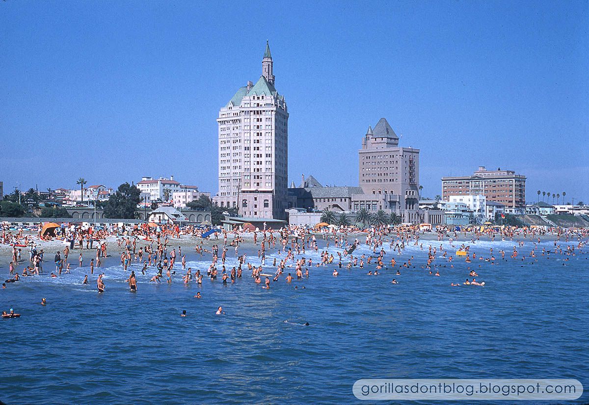
It looks like it was a beautiful day to be at the beach. Folks are working on their tans, or seek refuge beneath colorful umbrellas.


13 comments:
Major, I think you are right about that first pic being taken from Rainbow Pier. I've always been fascinated by the Villa Riviera building. I hope it is protected from being torn down!
The second pic is fun for people watching. It's kind of giving me a 1950's "Imitation of Life" vibe even though it's the wrong seacoast. What is that lady on the far right wearing? Culottes and a cape? And I see she is holding her smart phone, her cigarette, and her Hershey Krackle bar all in one hand.
Major-
Blue, blue, blue - indeed. All without the usual layer of "haze" so popular in images from So. Cal.
@ TokyoMagic!-
I'm no expert on women's clothing, either, but I would wager that lady is wearing a two-piece bathing suit. Although by 1959, some women on the 'cutting-edge of beach fashion' with the figure to handle it, would be wearing bathing suits with far less fabric-!
Thanks, Major.
The first images is a beauty. Perfect capture in every way. In fact it would make a wonderful postcard. Thanks, Major.
TokyoMagic!, Definitely an "Imitation of Life" vibe and probably because parts of the movie were filmed in Long Beach, not New York City. I always enjoy watching a Douglas Sirk Technicolor melodrama from the 1950's as there's nothing quite like them.
TokyoMagic!, it would not surprised me if the Villa Riviera building was torn down to make way for some godawful development, but let's cross our fingers and hope it doesn't happen. I've never seen "Imitation of Life", but I assume that the "cape" is just a towel?
Nanook, I agree, that is probably just a relativey modest bathing suit. Mmmm, cigarettes and chocolate, two great tastes that go great together.
K. Martinez, I guess I need to search out that movie... it's just a name to me, I know nothing about it at all.
@ Ken-
Ahhhh... Douglas Sirk. I have All that Heaven Allows on Blu-ray, with the Universal backlot standing-in for wherever the film's locale should be. This title was released in Technicolor; not so, however, for Imitation of Life, as Universal by then was discovering 'other' color processes which could be had for fewer dollars. But there's no denying that Douglas Sirk really choose his colors deliberately for greatest emotional effect - no matter which lab was responsible for the release prints.
I love the Long Beach of this era!
My favorite part of "It's a mad mad mad mad world" is the car chase scenes passing the ocean and through the streets of Long Beach/L.A. (cut together). Beautiful blue Sky. Thanks for posting.
@Nanook, You're correct. Now wasn't Magnificent Obsession and Written on the Wind in Technicolor like All that Heaven Allows? Those were between 1954-56 if I remember correctly. It was the Rock Hudson films that came to my mind when I was thinking about the 1950's Technicolor melodramas directed by Sirk. I have all three of those in Criterion.
@ Ken-
Yes, I believe you are correct on those two titles.
The problem with crediting a film with "Color by Technicolor" any time after Eastman Kodak developed a reliable, Dye-Coupler film stock, beginning in 1950, and the abandonment of the Technicolor, 3-Strip Camera is - for all intents and purposes, EVERYTHING was photographed on Eastman Kodak color negative stock (Okay - maybe Agfa, here and there). And during the years of the referenced films, we'd be talking Eastman 5258, and that negative could (and was) used by Technicolor to (ultimately) produce dye-transfer prints, with colors remembered for their lushness and beauty - even if a bit more so than in real life - or - by other labs using (probably) Eastman 5382, Color Print Film, which as we all know now, was prone to fading (along with their color negative film stocks, too.
The waters can get sullied even more if we're talking about digital copies of films: DVD's, Blu-rays, etc., as most-likely these days, the source material(s) are likely to come from those closest to, or actually from, original camera negative (OCN). And if so, the "Technicolor" most of us think of when remembering the color, is no longer the actual source utilized to author a DVD/Blu-ray master. However, we have seen first-hand on countless occasions, now, just how close to "real Technicolor" many titles look - in many cases, happily and frighteningly so-!
And let's not start down the road of 'different looks' for Technicolor, which is very real. I'm just happy for the great work being done now on older titles. (And as long as we're at it: Kodachrome-!)
Nanook, well, I knew the name “Douglas Sirk”, but was not sure if I knew of his movies really. After looking at IMDB, I am pretty sure I haven’t seen ANY of his. Not so sure I’m up for what sounds like very “soapy” content, but he seems to be highly regarded, so maybe I need to just get over it and watch one or two.
Alonzo, is that where the giant “W” was? I heard that those palm trees were recently removed, which seems like heresy.
K. Martinez, I need to turn in my “classic film fan” card. Plus the only Criterion disk I own is “The Third Man”.
Nanook, what about Cinecolor?? It’s such a shame to see older films that have degraded so much; it’s like 35mm slides I guess. Save a little money today, but in the long run YOU’LL PAY. What’s amazing to me is when films as recent as the 1990’s seem to be falling to pieces. What the hell?? Hasn’t Hollywood learned anything?
Major-
Well, you know... Cinecolor was a 2-Color process (although at the end, there was some 3-Color monkeying-around), and had plenty of issues - forget about any fading. Fer instance, the following info from WideScreen Museum: "The resulting two-color print was capable of containing pleasing colors but accuracy was hardly more possible than with any other two-color system. Great care was taken in original photography to use costumes and set colors that resulted in the desired final hues..."
And: "Cinecolor resulted in not only a limited palette, it also suffered from other problems that were decidedly inferior to the Technicolor system. Having the color elements on opposite sides of the film resulted in a soft projected image because it was not possible to hold focus on both records at the same time. Whereas Technicolor applied a silver based photographic soundtrack equal to or better than any black & white film, Cinecolor created a cyan or Prussian blue soundtrack on the blue-green side of the film. While it was possible, through the use of special photocells, to obtain acceptable quality soundtracks, the cyan colored track was not especially compatible with sound reproducers that had been used for black & white films. Theatres did not convert their sound systems just to make Cinecolor movies sound better and black & white movies sound worse. Other color processes, both two-color and three-color, have used dye based soundtracks with similar inferior results, including Technicolor for a brief period".
And more... "In 1948, Cinecolor introduced their three-color process. This was possible due to the emergence of three-color materials produced in the new Eastman color and Ansco color stocks, or from films made with the Technicolor three strip camera... "Cinecolor never became involved in the actual imaging of a three-color film. Despite the availability of full color films from Kodak and Ansco, a substantial amount of Cinecolor's product was two-color films made in the old bipack system. In 1954 the company went out of business and its assets were bought by Technicolor".
And there you have it.
Good choice on your one Criterion selection, Major. Harry Lime would approve!
Oh, and Long Beach never looked better...
Thanks
Nanook, Awesome info! Interesting thoughts on Technicolor in the different media besides the projected film itself. I loved watching DVD extras on the Technicolor process and restoring the films for DVD/Blu-ray release, but it didn't occur to me that it's different than what was actually watched in the theater back then. Also, I never new about Cinecolor's 2-color process effecting the sound quality. Very interesting. Thanks!
Major, Yeah, I have a lot of Criterion because I love older foreign language films (with subtitles only). They recently released some really great Satyajit Ray films I was waiting for. Criterion also releases some pretty cool U.S. titles that I like to get once in a while like the Douglas Sirk films.
@ Ken-
Yeah, the stuff you learn when running 'older' films...
Post a Comment