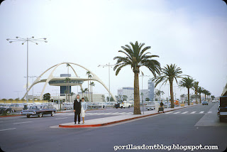
Most airports are not things of beauty (though some have structures that stand out, such as the former TWA terminal at JFK). Their purpose is to move many thousands of people through as efficiently as possible, and not much thought seems to be given to aesthetics. Los Angeles International Airport (LAX) is a typical big-city airport in most ways, but it has one of the most striking pieces of architecture anywhere; the "Theme Building". There it is (from November, 1964), looking futuristic and cool! The Theme Building was dedicated by Vice President Lyndon B. Johnson in 1961.
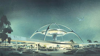
Here's a wonderful 1961 architectural rendering. From Wikipedia: Influenced by "Populuxe" architecture, it is an example of the Mid-century modern design movement later to become known as "Googie". Constructed near the beginning of the Space Age, the building is an example of how aeronautics and pop culture, design and architecture came together in Los Angeles.
The distinctive white building resembles a flying saucer that has landed on its four legs. The initial design was created by James Langenheim, of Pereira & Luckman, subsequently taken to fruition by a team of architects and engineers headed by William Pereira and Charles Luckman, that also included Paul Williams and Welton Becket.
The next two images are from 1977. The glassed-in area used to be a restaurant, which never rotated, though many people will swear that it did. Even those breezeway blocks are wonderfully mid-century. The appearance of the building's signature crossed arches as homogeneous structures is a design illusion, created by topping four steel-reinforced concrete legs extending approximately 15 feet above the ground with hollow stucco-covered steel trusses. To counteract earthquake movements, the Theme Building was retrofitted in 2010 with a tuned mass damper without changing its outward appearance.
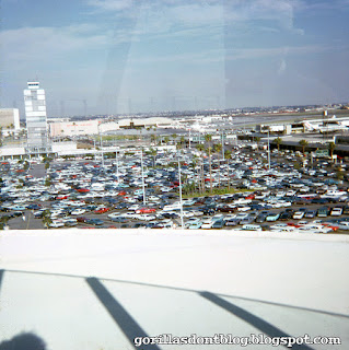
Here's a view from the observation deck, with the airport's old control tower to the left, along with some hangars and a bit of runway in the distance.
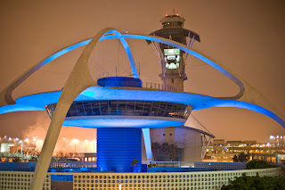
Here's a contemporary shot of the building at night, as you can see, it's pretty great! Ocean fog often descends on LAX in the evenings, as in this photo.
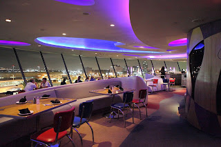
Here's a nice interior (from Wikipedia) showing the inside of the "Encounters" restaurant, designed by Walt Disney Imagineering, which opened in 1997. I had dinner there one time with a friend who is a Jet Blue flight attendant, it was a fun experience. When the elevator doors closed, a kooky song (by Esquivel, perhaps) played. Sadly, Encounters closed at the end of 2013, mostly due to the fact that travelers had to leave the secure areas to dine, and would have to go through the whole security screening process again if they wanted to return to their gates. As far as I know this area has been shuttered ever since.
I hope you have enjoyed your visit to the LAX Theme Building!
I'm still out of town, but should be home soon

Major-
ReplyDeleteSome lovely shots of LAX's best feature. In the 3rd and [especially] in the 5th image, one can clearly discern the reinforcing 'guy wires' added shortly after the building's construction, as the engineers made a little "boo-boo" when determining the amount of loading the arches would experience during windy conditions. Although a bit distracting, those cables seemed to do the trick.
Thanks, Major.
I love the composition of that first shot. Nice views of this airport.
ReplyDeleteI had to Google "tuned mass damper," so I just learned something new, today. Interesting.
Thanks, Major. Aloha!
I have always love the Theme Building's architecture. I took a photo of it in 2010 or thereabouts, when it was covered in scaffolding. If I can find that photo, I'll provide a link to it. If I'm remembering correctly, before the rehab, a large panel on one of the arches had fallen off, but nobody was injured below.
ReplyDeleteI never did make it inside the building. I believe there was an article in Disney News Magazine, about Disney designing the Encounter restaurant. Wasn't there a large floor to ceiling Lava Lamp somewhere inside the restaurant?
JB, it looks like there is a small black swan on one of the Encounter dinner plates. It's waiting for unsuspecting prey to come and sit down at the table.
Thanks for these LAX pics, Major!
Such an iconic structure. Beautiful, inspiring, and futuristic. Like Seattle's Space Needle, it's an excellent example of Googie design. I like how they even made the street lights futuristic. Even the row of palm trees (royal palms?) looks impressive and stately. The night shots really look nice. I wasn't aware that Disney had a hand in its appearance; the restaurant anyway.
ReplyDeleteI seem to remember the Theme Building getting destroyed in the movie "Earthquake" (1974). It was probably the low frequency vibrations coming from the Sensurround speakers that caused it to collapse. ;-)
Given L.A.'s penchant for tearing down everything that looks neat and replacing it with mundane, utilitarian structures, I'm surprised it's still here.
Nanook, thanks for the cable info. I was wondering if those were added later, or what.
Tokyo!, OMG!, you're right! Little black swans everywhere! SOMEBODY DO SOMETHING BEFORE IT'S TOO LATE!!!
Thanks for the cool shots of a cool structure, Major.
I don’t know what a “tuned mass damper” is, but I want one. Any anagram of “deadman stumpers” is a keeper as far as I’m concerned.
ReplyDeleteIn the fourth picture at extreme right is a United Airlines 727 (hard to tell at this angle, but I think it’s the shorter 727-100 rather than the 20 ft longer 727-200; United operated both). The only other identifiable aircraft is a Western Airlines 707 parked in front of the hangars in the left center of the image.
Note the orange sky in the fifth photo, proving that color does appear in the real world, just like in cartoons.
Note the red diner chairs in the last photo. We have a set of four in our kitchen of the same design with two-tone cushions that Mrs. Chuck special-ordered for her red-and-white retro Coke kitchen when we lived in Omaha nearly 20 years ago, and those things have stood the test of time, proving themselves able to stand against everything except dog teeth. You can buy a set of two for your own kitchen or airport restaurant for just $339.95 (kitchen or restaurant sold separately).
Thanks, Major!
There is something goofy and magical about Googie architecture, though it's dated it's still futuristic. Tomorrowland-67 is Googie heaven. Have you ever noticed that the base of the Peoplemover/Rocket Jets platform has sweeping arches in it's design, like the Theme building?
ReplyDeletePlease, Disney, fix tomorrowland.
Terrific post Major.
ReplyDeleteDefinitely one of the mid-century icons of LA or anywhere. A distinguished design team. There has been controversy from time to time over Paul Williams role, but I’m sure he was involved, and written out of the script because “reasons”.
The highlight of my career was remodeling (oh so gently) a Paul Williams design on La Mesa Drive in Santa Monica.
What a shame that the airport has evolved in a way that the building is no longer viable. You are fortunate to have been inside. I hope a use can found, maybe a museum of 60’s architecture?
Chuck and Sue, everyone should have a tuned mass damper, it’s an amazing invention, right up there with the tachyon gravitic inverter, except the TMD really exists while the TGI hasn’t been invented yet. I’ve never been on a project with a TMD, but they are pretty standard in the super-tall/super-thin towers like 451 Park in NYC. I believe Citibank Tower there was one of the first to use one.
MRaymond, I choose to believe that the PeopleMover tower was inspired by the Theme Building, but really have no idea. Mike Cozart has some working drawings for those arches posted on his blog. Amazing work all figured out pre-computer.
Nanook, those wires are like the iron rods in the Loggia de Lanzi in Firenze, meant to carry the tension loads and not otherwise be noticed. Tsk tsk.
JG
JG, I thought all police call boxes were equipped with tachyon gravitic inverters. Maybe mine is unique.
ReplyDeleteThis comment has been removed by the author.
ReplyDeleteAlways loved that building. Never had too much time to investigate it. Wish I had had the chance to eat there. LAX was that crazy place our planes landed and then we walked, sometimes ran to wherever we needed to be. Sometimes to the Disneyland shuttle, which were the fun trips.
ReplyDeleteThat first pic is a nice shot. The open truck on the Cadillac on the right really pulls it together.
Chuck, I think it's Self-sealing Stem bolts you need. You can pick up extras on DS9.
Thanks Major.
"The Theme Building"...hmm...that's the only name they could come up with? I've seen and LOVED this building since I was a wee tot, coming back and forth with my European parents, or solo. Yes...those were the days of taking your kids to the airport and sending them off to foreign lands by themselves. It was quite normal, and generally we rode TWA who had the best kids "play set" out of all of them. We also rode SAS and British Air, which my parents preferred, but did not have the fun of TWA. TWA also had those "lounges" back then with bars and things, and lovely stewardesses who would change into cocktail pajamas to serve...well...cocktails. I recall that is where they would corral all of the kids going solo on the plane, although most of the time, they were "oh...are you traveling by yourself?"...(they asked a 10 year old.) I would make connections in Heathrow, go through customs, etc. When I got marginally older I traveled with my 4 year old sister...again..by ourselves. Very independent young lad was I, and still am. In any case...I PINED to go to that restaurant! Generally, we were told no, or we don't have time...etc. I did dine there later as an adult, the view was memorable, the dinner was not. It's actually hard to get there, and difficult to navigate. That was before they put the second level of traffic up...which just made it all worse. LAX is perhaps my least favorite airport to fly in and out of. It is not glamourous. At all. It is chaos. Returning a rental car is unpleasant. It's generally ugly. The terminals are generally ugly. In 1984 for the Olympics it was as glamourous and clean and tidy as it's ever been in it's lifetime. It was an exciting Summer and we (Disneyland crew) would often go to meet people off planes, dignitaries, or teams, or Corporate sponsor people...everyone thought we worked for Scottish Airlines. In some cases we met planes on the tarmac. We went through back doors and an x-ray never came near us. Us Disneylanders weren't considered a threat in the pre 911 world. We also had been screened by both the FBI, CIA, etc. etc. etc. at the beginning of the season as we would host a variety of basically people who other people wanted to kill. So...I guess we WERE pretty safe. That was a fun year, even though there was so much internal chaos at the time in those last days of Ron Miller. I did not get to the WED version (or WDI I guess) of the restaurant. This would be a place to go prior to taking off...but there wasn't a shuttle, there is no autonomous rail transport...what do you do? Take a cab? That distance is not close...and with bags and what not...I can see how it "didn't work". Perhaps turn this space into an "experience" like that Pan Am restaurant. Or even better to a super cool hotel 'ala TWA at JFK. Then I would stay there. Those hotels around LAX leave much to be desired. I stayed in a couple of them in the early Mid early 2000's. None had any particular merit. LAX in the swinging 60's was pretty groovy. For a "real time" look, it's in all the opening scenes of "Airplane". A movie that still stands up after decades. And don't call me Shirley.
ReplyDeleteBack in the 60s, "Man From UNCLE" did a two-parter that featured a supervillain compound located in Tibet or somewhere like that. The LAX theme building was used for some exteriors, preceded by a matte painting to imply it was located far from civilization. A soundstage set with big windows impersonated the interior. They evidently assumed the building wasn't quite famous enough to jump out as a Los Angeles landmark.
ReplyDeleteAnyway, it was released abroad as a movie titled "How to Steal the World" (released by Warner Archive in a set of similar UNCLE movies). Much as several "Wonderful World of Color" two-parters played on foreign movie screens before debuting on American television: "Doctor Syn, Alias the Scarecrow", "Escapade in Florence", "The Horse Without a Head", "Hans Brinker", "The Magnificent Rebel", etc. A key difference was that the Disney shows were shot abroad (and needed theatrical releases to justify the cost), while the Man from UNCLE was mostly MGM backlot pretending to be the world.